Header options overview
The default header options are managed from:
Theme Options → Header
From this section, you can manage the header layout, logo position, login/register options, submit button, top bar, hero media header, mobile menu, and header colors.
Header settings

Wide header
Enable this option if you want the header to use the full screen width.
Phone number
Add the phone number you want to display in the header, next to the Login/Register icon. Leave the field blank if you do not want to show a phone number.
Header layout
The header layout controls the position of the logo, menu, login area, and submit button.
You can choose from the available header types. Each type has a different structure.
- Header type 1 setup
- Header type 2 setup
- Vertical header setup
- Header type 5 setup
- Header type 6 setup
Some header types include extra options. For example, when using the two-row header layout, additional settings will be available.

Logo position in header
Choose where the logo should be displayed in the header.
- The Center logo option does not apply to all header types.
- For the vertical header, selecting the right position aligns the menu vertically on the right side of the page.
Header height
Add the header height in pixels. Use numbers only.
Sticky header height
Add the sticky header height in pixels. Use numbers only.
Top menu font size
Set the font size for the main menu items. Use numbers only.

Menu item font size
Set the font size for submenu items.

Border below header
Add the height of the colored border below the main header. Use numbers only.

Border below sticky header
Add the height of the colored border below the sticky header. Use numbers only.
Login, register and submit options

Show user login menu in header
Enable this option if you want to display the login/register icon or user menu in the header.
Related help:
Manage users, agents, agencies and developers
Show submit property button in header
Enable this option if you want to display the Add Listing or submit property button in the header.

The submit button opens the front-end property submission page. The property is saved only after the user logs in or registers.
Related help:
Login and register setup

Users can type the password on registration form
Enable this option if you want users to create their own password during registration.
If disabled, the password is generated and sent by email.
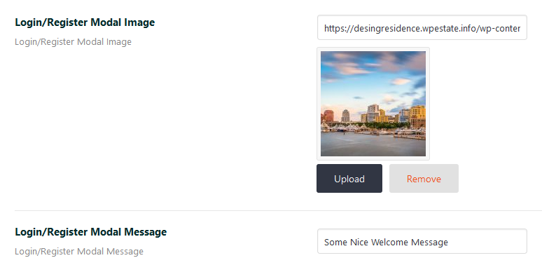
Login/Register modal image
Upload the image shown in the login/register modal.
Login is mandatory to save favorite properties
Choose if visitors must be logged in before saving favorite properties.
Help:
Save favorites
Redirect URL after login
Add the URL where users should be redirected after login.
If this field is left blank, users are redirected to the dashboard profile page.
Help:
Create user dashboard pages
Register reCaptcha settings
reCaptcha is optional. Theme forms are already secured with WordPress nonces, but you can enable reCaptcha for extra protection on registration forms.

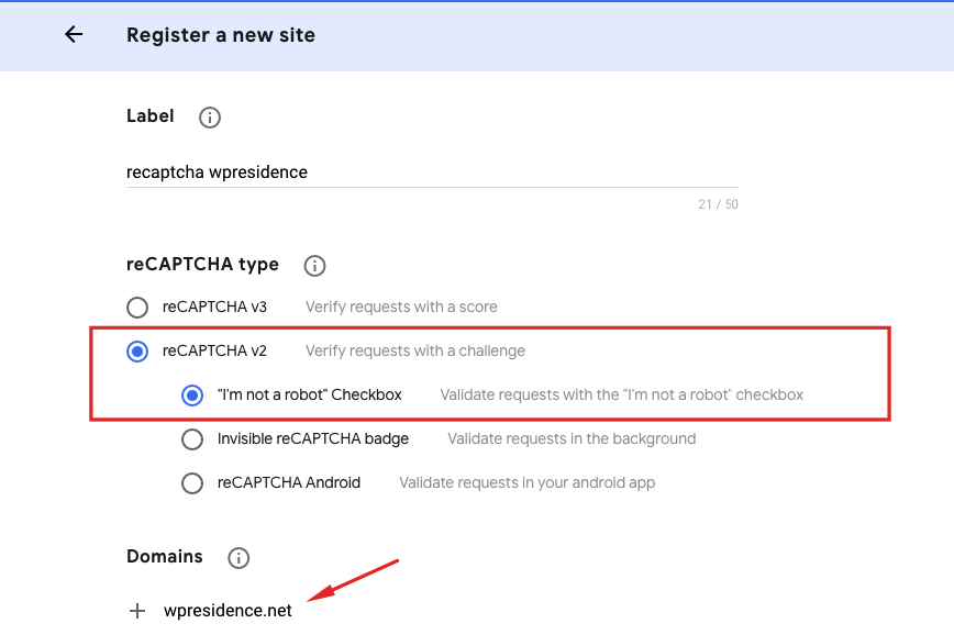
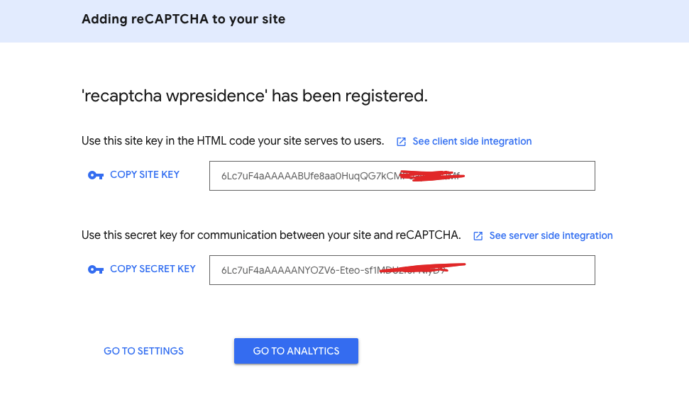
Set reCaptcha API keys
- Go to Google reCaptcha admin.
- Create the reCaptcha keys for your domain.
- Select reCaptcha v2.
- Copy the Site Key and Secret Key.
- Paste the keys in the theme reCaptcha settings.
Invalid domain for site key error
If you see this error:
Recaptcha: ERROR for site owner: Invalid domain for site key
Check the domain added in Google reCaptcha. The domain must not include protocol, path, port, query, or fragment.
Correct format:
yourdomain.comIncorrect formats:
https://yourdomain.com
yourdomain.com/page-name
yourdomain.com:443
I am not a robot does not load
If the checkbox does not load, ask your hosting company to check if allow_url_fopen is enabled in PHP.
Top bar settings
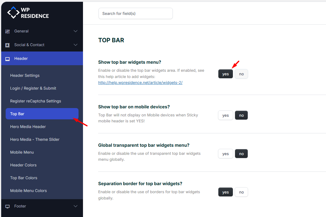
Show top bar widgets menu
Enable this option if you want to show the top bar widget area.
After enabling it, add the widgets you want to display in the top bar.
Help:
Manage widgets
Show top bar on mobile devices
Enable this option to show the top bar on mobile.
Global transparent top bar widgets menu
Enable this option if you want the top bar to be transparent globally.
This option can also be overridden per page from the page Appearance Options.
Help:
Custom header options
Separation border for top bar widgets
Enable this option if you want borders between top bar widgets.
Hero media header

Global transparent header
Enable this option if you want the header to be transparent over the hero media.
Transparent headers usually work best with a dark hero image or video and light menu colors.
You can also enable or disable the transparent header per page from the page Appearance Options.
Help:
Transparent header setup
Global hero media header type
Select the default hero media used across pages.
Help:
Global header media options
Hero media header type for taxonomy pages
Select the hero media used globally for taxonomy and category pages.
Hero media header type for blog posts
Select the hero media used for blog posts.
Parallax effect for image or video hero media
Enable this option to add a parallax effect for image or video hero media.
The parallax effect applies when the image height is larger than 300px.
Change text over header with user location on home
Enable this option if you want the homepage header text to include the visitor location.

Heading with user location
Add the text shown over the homepage hero media when the location option is enabled.
Use %city% where you want the detected city name to appear.
Hero media theme slider
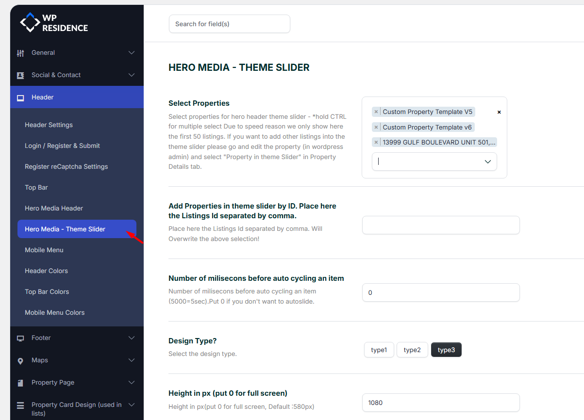
The theme slider displays selected properties in the hero media area.
The slider uses the featured image of the selected properties.
Help:
Manage Theme Slider settings
Mobile menu

Use sticky mobile header
Enable this option if you want the mobile header to stay visible while scrolling.
Header colors
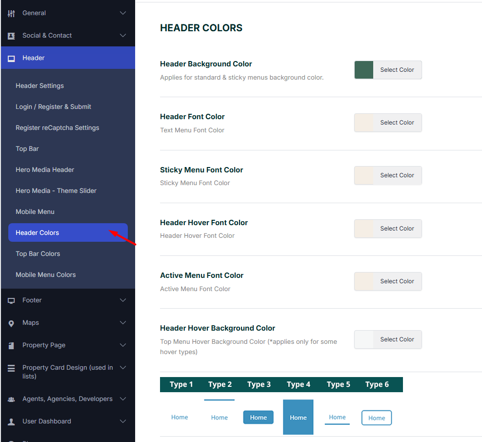
From this section, you can manage the colors for the desktop header.
Available color options include:
- Header background color
- Header font color
- Sticky menu font color
- Header hover font color
- Active menu font color
- Header hover background color
- Top menu hover type
- Transparent menu font color
- Transparent menu hover font color
- Dropdown menu background color
- Dropdown menu item font color
- Dropdown menu item hover font color
- Dropdown menu item hover background color
- Dropdown menu item border color
- Border below header color
- Border below sticky header color
- Second row background color for supported header layouts
- Second row font color for supported header layouts
Top bar colors
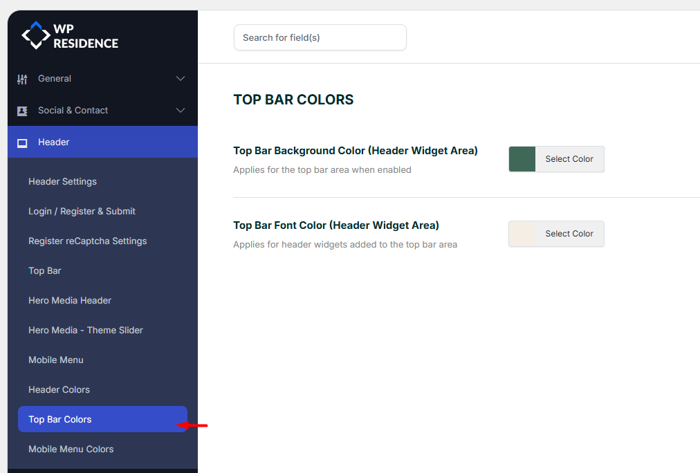
From this section, you can manage:
- Top bar background color
- Top bar font color
Help:
Manage top bar widgets
Mobile menu colors

From this section, you can manage:
- Mobile header background color
- Mobile header icon color
- Mobile menu font color
- Mobile menu hover font color
- Mobile menu item hover background color
- Mobile menu background color
- Mobile menu item border color