In Theme Options → Property Page, you can manage the settings for the default single property page design.
From this area, you can control the hero media shown at the top of the property page, the property gallery style, the content layout, the sidebar, and the visibility of individual property sections.
Property page design
This section controls the main layout and display options for the default property page template.
The Property Page Hero Media is different from the Property Media Section.
- Property Page Hero Media is the first section below the header.
- Property Media Section is the image and video gallery area shown inside the property page content.
This is also different from Theme Options → Header → Hero Media, which manages global hero media for pages, posts, agents, and other areas. For single property pages, use Theme Options → Property Page.
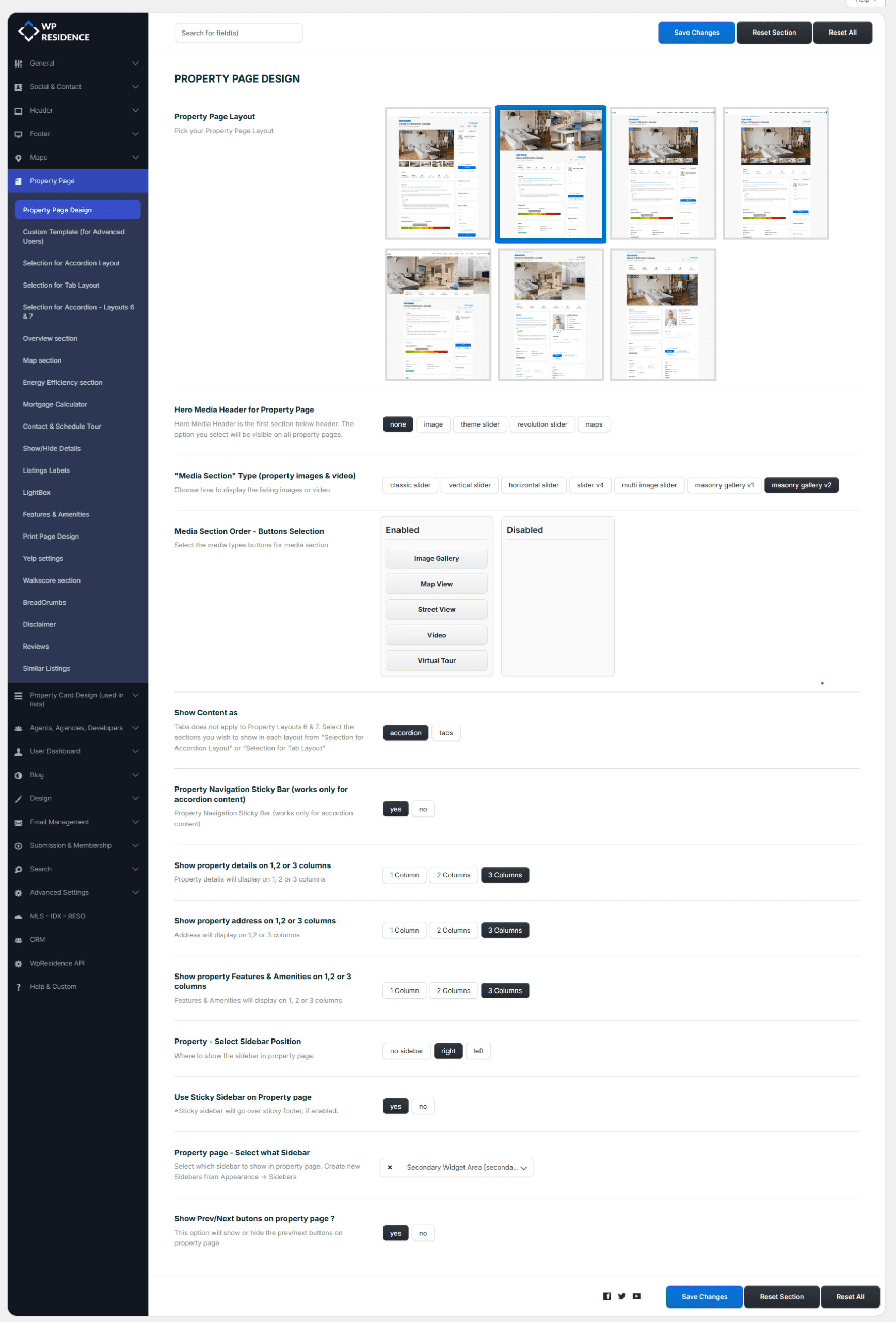
Property page layout
Choose the layout you want to use for the default property page template.
Layout 1
Layout 2
Layout 3
Layout 4
Layout 5
Property page global hero media
The Hero Media is the first section below the header on the property page.
The option selected here will be visible on all default property pages, unless the property has custom display options saved at property level.
You can choose one of the following hero media types:
- None – no hero media is displayed.
- Image – displays a static image in the property page hero area.
- Theme Slider – displays the theme slider using the properties selected in the Theme Slider settings.
- Revolution Slider – displays a Revolution Slider by alias name.
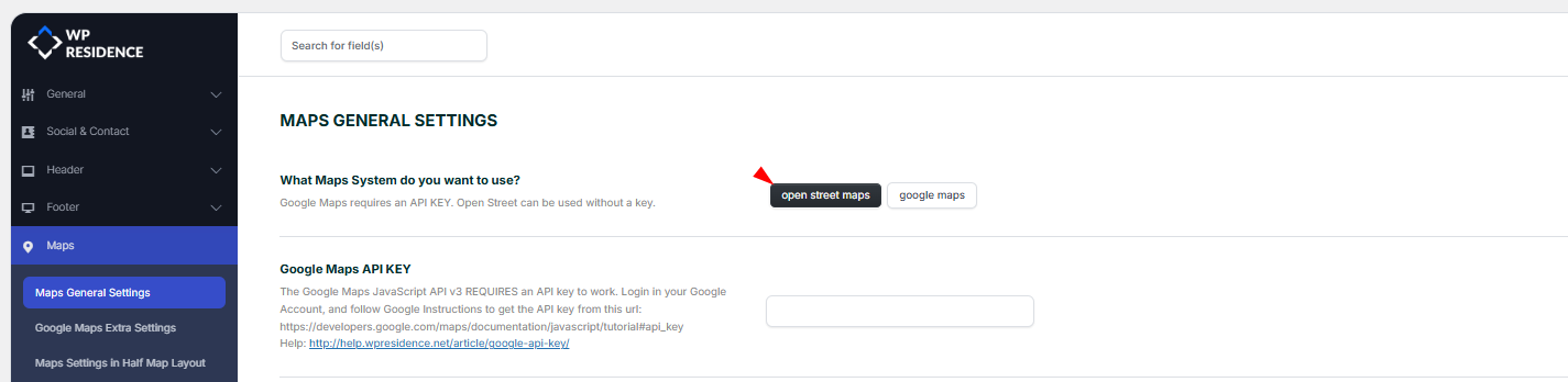
- Maps – displays the map as the hero area.
If you choose Image, use a wide image because it will be displayed full width.
If you choose Theme Slider, the slider properties and slider design are managed from the Theme Slider settings. You can also include a property in the Theme Slider from the property editor.
If you choose Revolution Slider, you must add the slider alias exactly as it appears in Revolution Slider settings.
If you choose Maps, the map settings are controlled from Theme Options → Maps.
Property media section type
This option controls the property gallery style inside the page content. It does not control the global Hero Media described above.
You can choose between:
- Classic Slider
- Vertical Slider
- Horizontal Slider
- Full Header Slider
- Multi Image Slider
- Masonry Gallery V1
- Masonry Gallery V2
Media section order and buttons selection
Select the media type buttons you want to show in the property media section.
This option applies to Classic Slider, Vertical Slider, and Horizontal Slider.
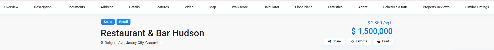
Show content as
You can choose how the property page content will be displayed:
- Accordion
- Tabs
Property navigation sticky bar
This option works only when the property content is displayed as accordion content.
If enabled, it shows a sticky navigation bar for the property sections.
Details, address, and features columns
You can choose how many columns are used for these property page sections:
- Property details – show on 1, 2, or 3 columns.
- Property address – show on 1, 2, or 3 columns.
- Features and amenities – show on 1, 2, or 3 columns.
Property sidebar settings
These options control the sidebar used on the default property page.
- Property – Select Sidebar Position – choose where the sidebar is displayed.
- Use Sticky Sidebar on Property page – keeps the sidebar visible while scrolling.
- Property page – Select what Sidebar – select the sidebar used on the property page.
You can create custom sidebars from Appearance → Sidebars.
Previous and next property buttons
Use Show Prev/Next buttons on property page? to show or hide the previous and next property navigation buttons.
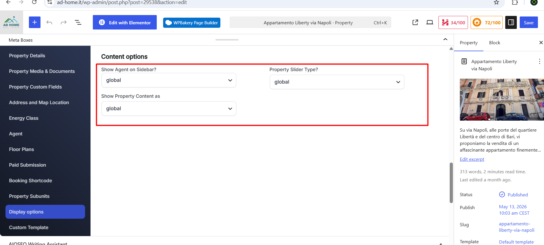
Property-level Display Options and Global Theme Options
The settings from Theme Options → Property Page are global settings. They apply to the default property page template.
A property can also have its own display settings saved inside the property edit page. These property-level settings can override the global settings for that property only.
This is useful when one property needs a different slider type, sidebar behavior, or content display style from the rest of the website.
If you want all properties to follow the global settings from Theme Options, the property-level display options must be set to global.
Where to check the property-level display options
Edit the property and go to:
Property Details → Display options
Check these options:
- Show Agent on Sidebar?
- Property Slider Type?
- Show Property Content as
If these fields are set to global, the property uses the settings from: Theme Options → Property Page
If one of these fields is set to a specific value, that setting applies only to that property and can override the global Theme Options setting.
If Theme Options still do not apply
If the property-level display options are set to global, but Theme Options still do not apply, check the following:
- Confirm the property uses the default property page template.
- Check if a Custom Property Template is assigned.
- If a custom property template is used, edit the layout from the custom template instead of Theme Options.
- Clear theme cache, plugin cache, server cache, CDN cache, and browser cache.
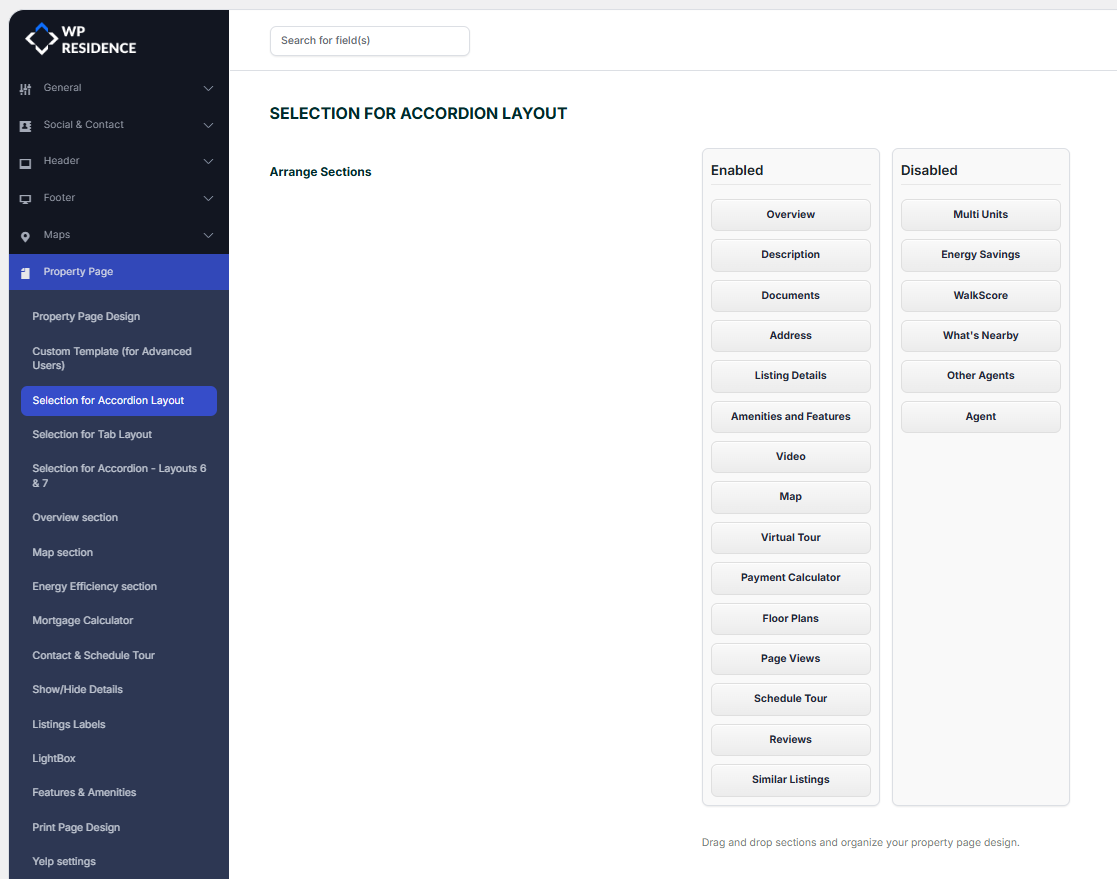
Selection for accordion layout
This section controls which property page blocks appear when the default property page uses the Accordion content layout.

Items placed in Visible will show on the property page. Items moved to Disabled will not show.
Selection for tab layout
This section controls which property page blocks appear when the default property page uses the Tab content layout.
Items placed in Visible will show on the property page. Items moved to Disabled will not show.
Selection for layouts 6 and 7
This section controls the content areas used only by Property Layouts 6 and 7.
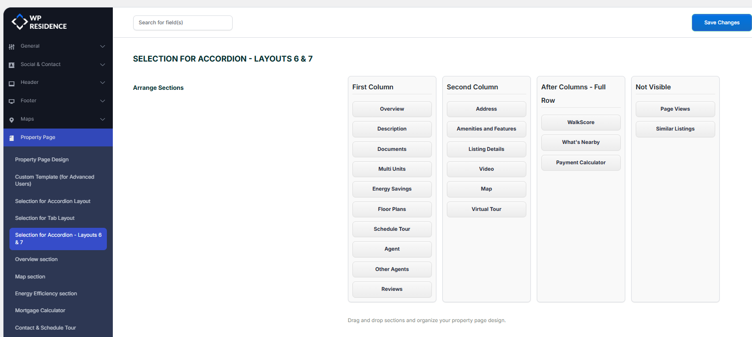
Layouts 6 and 7 include three content areas:
- First column
- Second column
- After columns
The elements placed in these visible areas will show on the property page. Elements moved to Not Visible will not show.
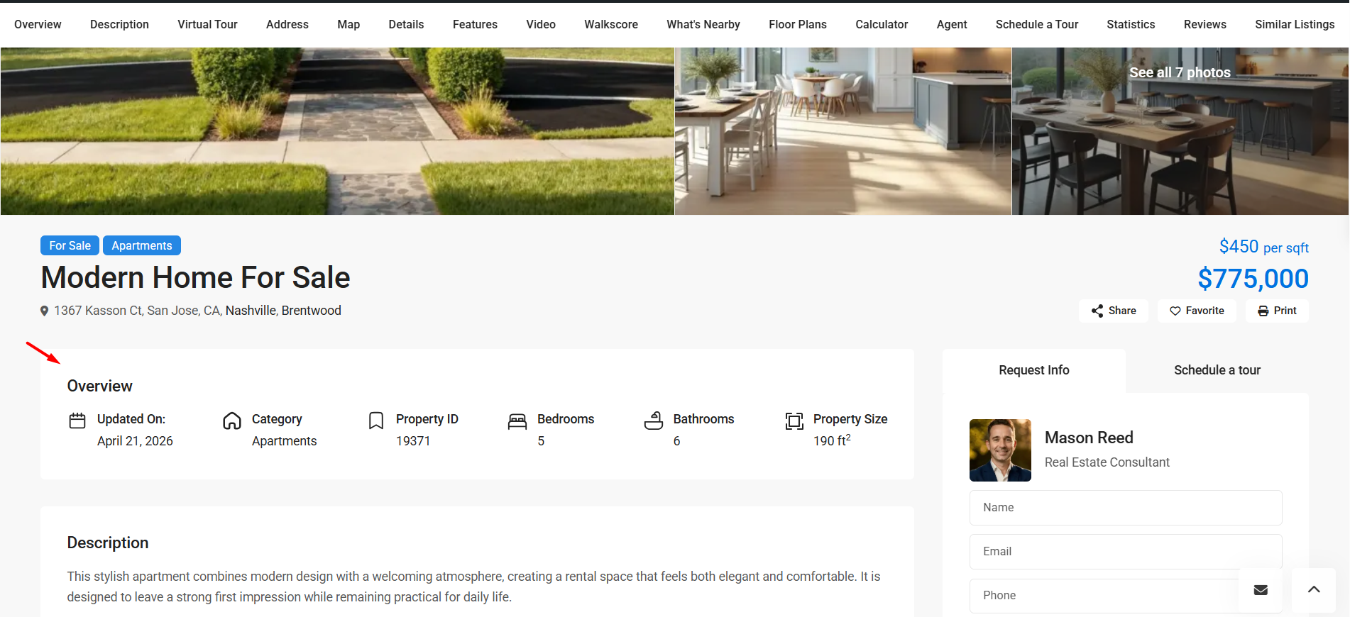
Overview section
This section controls the compact overview block that highlights key property information on the single property page.
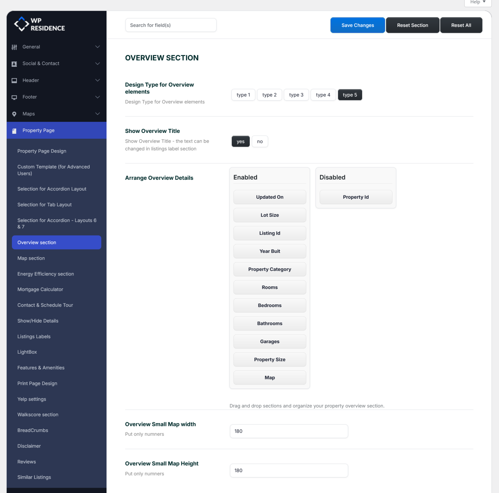
You can manage these options from Theme Options → Property Page → Overview section.
The Overview section can display information such as:
- Updated on
- Lot size
- Listing ID
- Year built
- Property category
- Rooms
- Bedrooms
- Bathrooms
- Garages
- Property size
- Small map
- Property ID
Overview design type
The Design Type for Overview elements option changes the visual design of the overview information.
Available styles are:
- Type 1
- Type 2
- Type 3
- Type 4
- Type 5
Show overview title
Use Show Overview Title to show or hide the section title above the overview block.
- Yes – the Overview title is displayed.
- No – the Overview title is hidden.
The title text can be changed from the property labels settings.
Arrange overview details
The Arrange Overview Details area lets you control which property details appear in the Overview section and in what order.
- Enabled – items that will appear in the Overview section.
- Disabled – items that will not appear.
You can drag and drop items between these columns.
Overview small map width and height
If you enable the Map item in the Overview section, you can control its size with:
- Overview Small Map width
- Overview Small Map height
These fields accept numbers only.
If you use the Map item in the Overview section, check the map API settings below to avoid a broken map image.
For Google Maps
Enable the Maps Static API in your Google Cloud project.
Help: Google API key setup


For OpenStreetMap
Add a MapBox token to allow map images to load.
Help: OpenStreetMap and MapBox setup
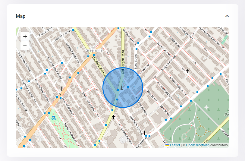
Map section
This section controls how the property map appears on the single property page.
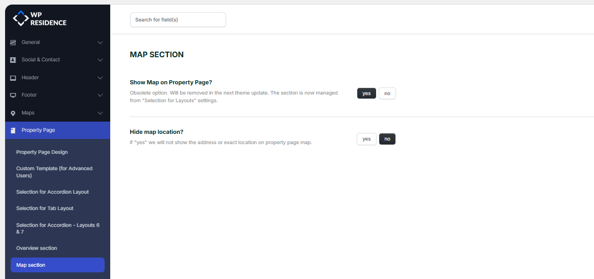
Show map on property page
Enable or disable the map section on the property page.
Hide map location
If set to Yes, the exact location or address will not be shown on the property page map.
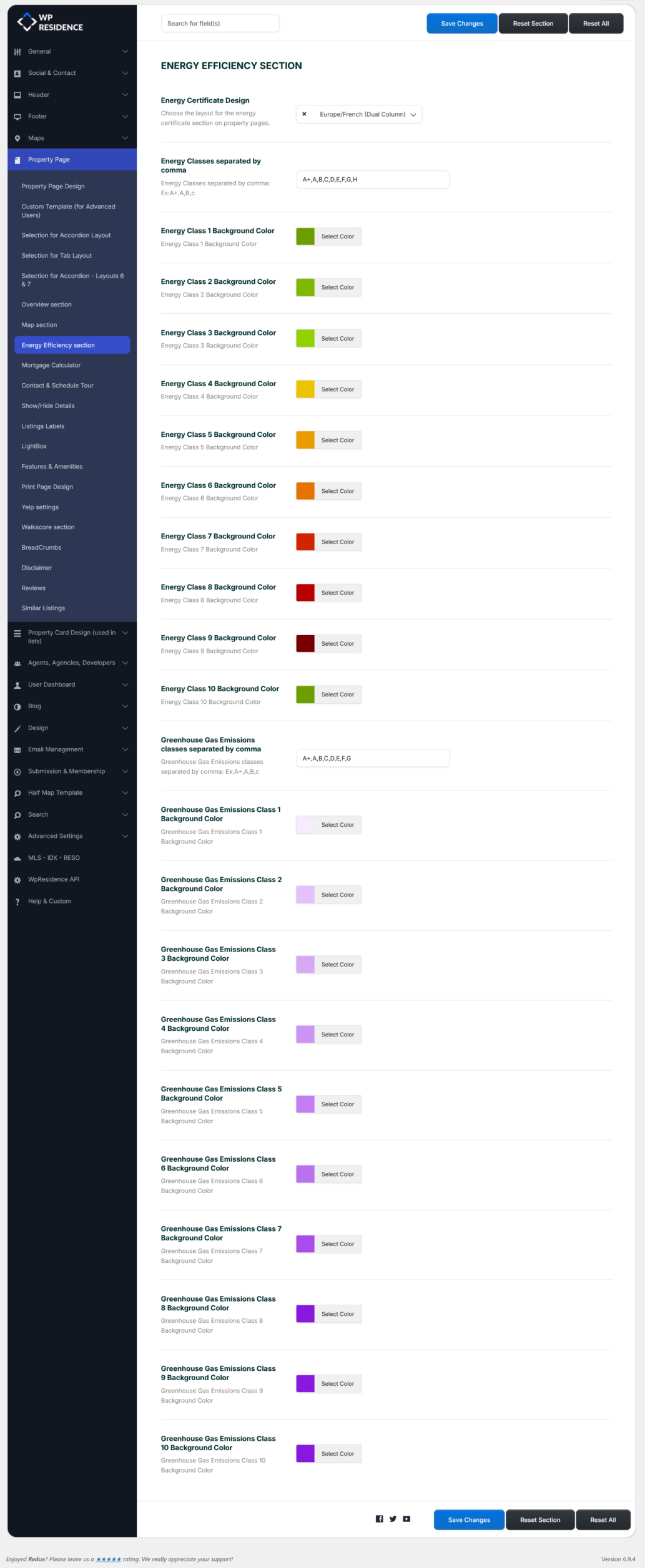
Energy efficiency section
This section controls the property energy efficiency and greenhouse gas emission details.
Help: Energy class certificate for EU market
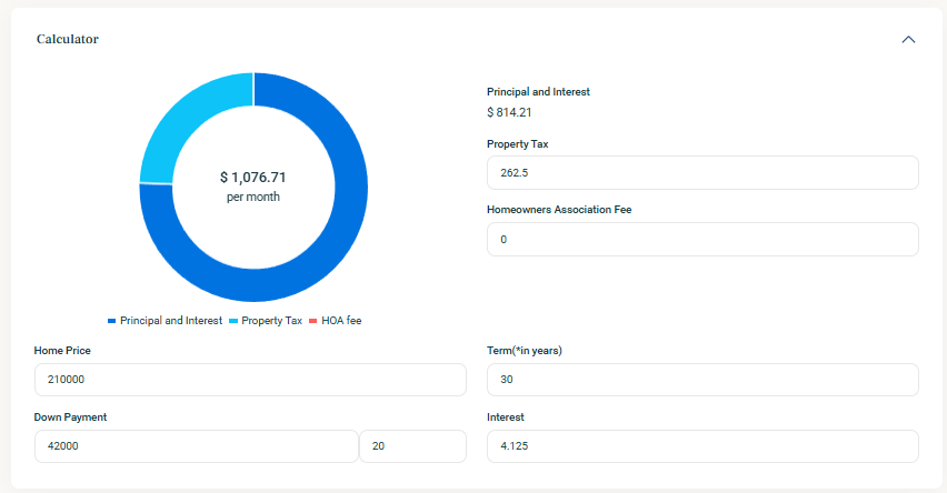
Mortgage calculator
This section controls the built-in mortgage calculator shown on the property page.
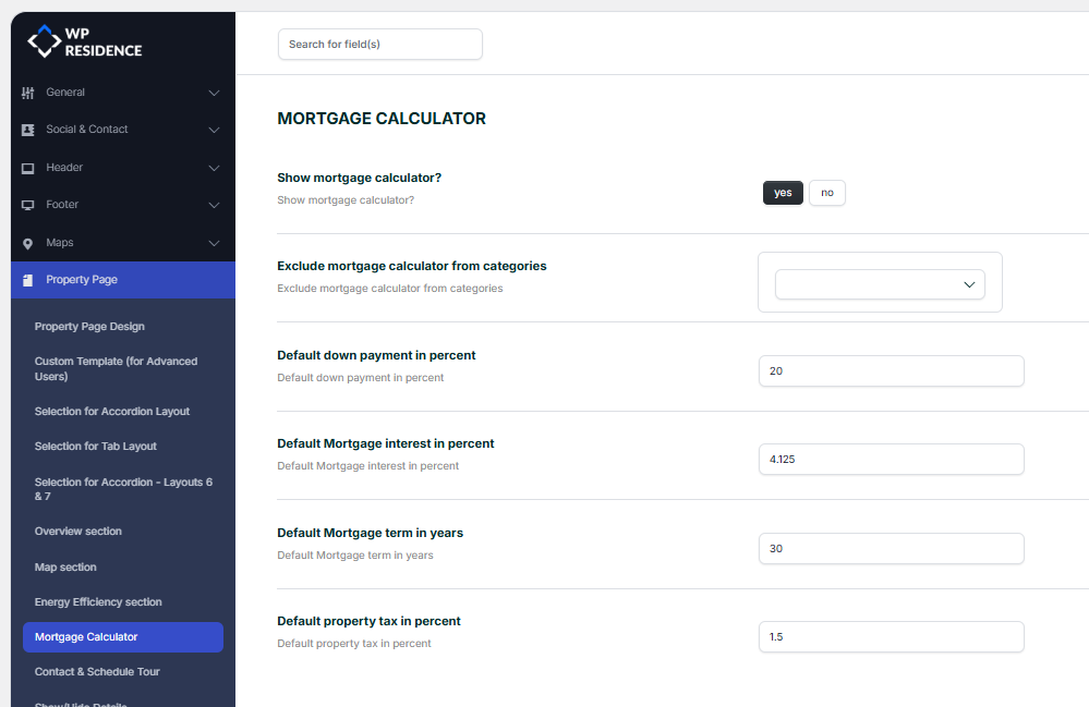
You can configure:
- Show mortgage calculator?
- Exclude mortgage calculator from categories
- Default down payment in percent
- Default mortgage interest in percent
- Default mortgage term in years
- Default property tax in percent
The mortgage section will appear on the property page:
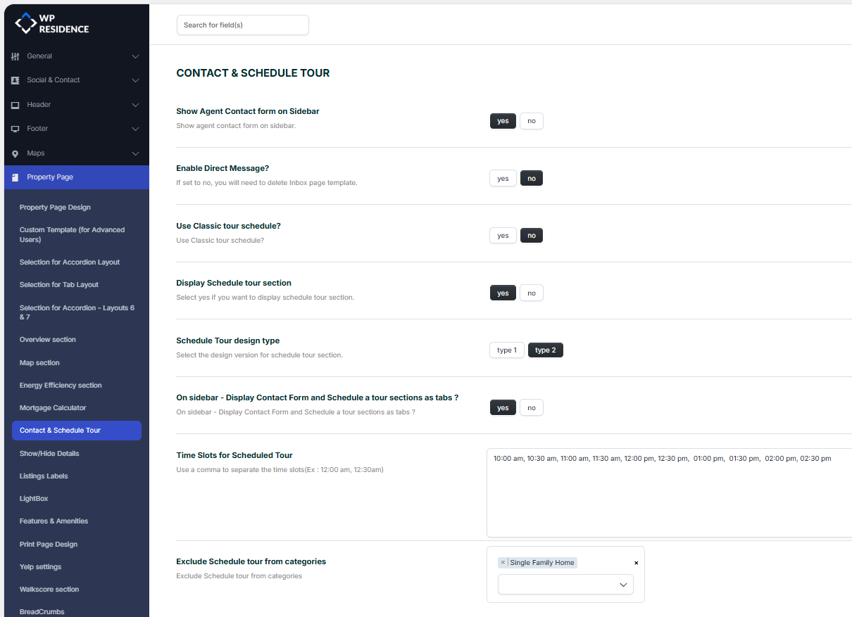
Contact and schedule tour
This section controls the contact form and schedule tour options shown on the property page.
Help: Contact and schedule tour settings
Show or hide details
This section controls the visibility of small interface elements on the property page.
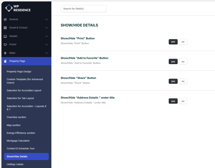
Print button
Show or hide the Print button.
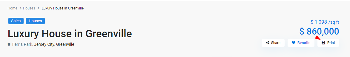
Add to favorite button
Show or hide the Add to Favorite button.
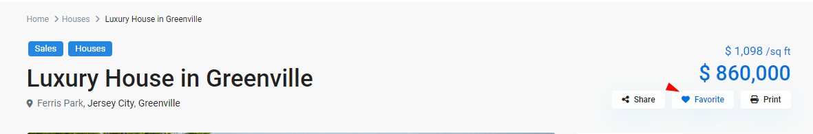
Share button
Show or hide the Share button.
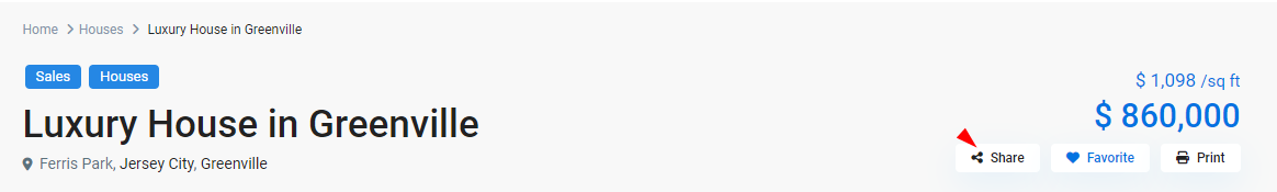
Address details under title
Show or hide the address details displayed under the property title.

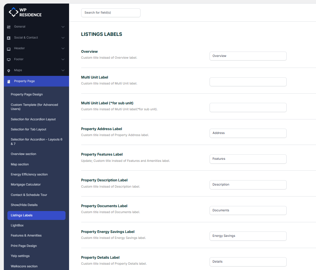
Listing labels
This section controls the text labels used on the property page for listing information.
Help: Listing labels settings
Lightbox
This section controls how the image lightbox works on the property page.
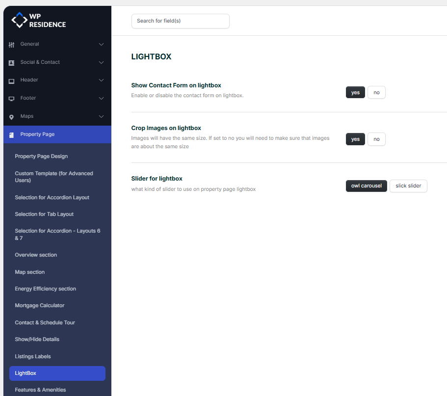
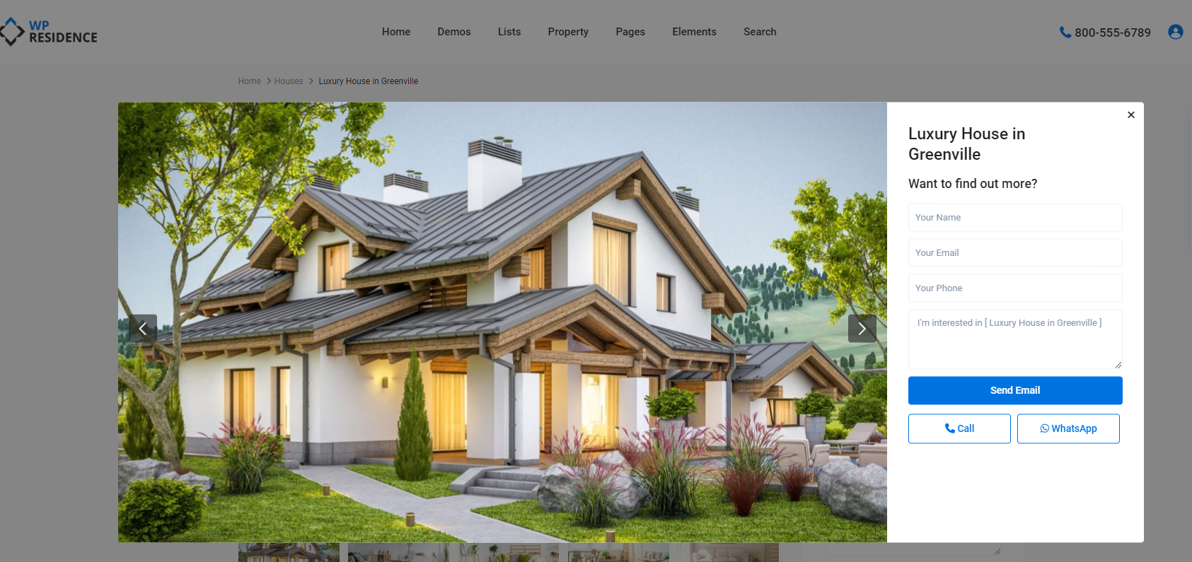
Show contact form on lightbox
Show or hide the contact form inside the lightbox.
Crop images on lightbox
If set to Yes, images will be cropped to the same size.
If set to No, make sure the uploaded images have similar sizes for the best result.
Slider for lightbox
Owl Carousel
When Owl Carousel is selected, the lightbox uses a modern, touch-friendly slider designed for smooth navigation.
This option is recommended in most cases because it:
- Handles swipe gestures well on mobile and tablets.
- Provides smooth transitions between images.
- Works reliably with a large number of photos.
- Is well tested across different browsers and devices.
Slick Slider
When Slick Slider is selected, the lightbox uses an alternative slider engine.
This option can be useful if:
- The slider crashes on iOS or mobile devices.
- You prefer Slick Slider animation style.
- You have tested it and prefer how it works for your audience.
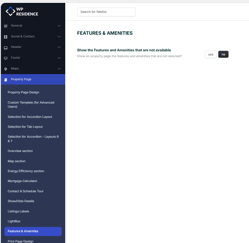
Features and amenities
This section controls the labels and display settings for property features and amenities.
Help: Features and amenities settings
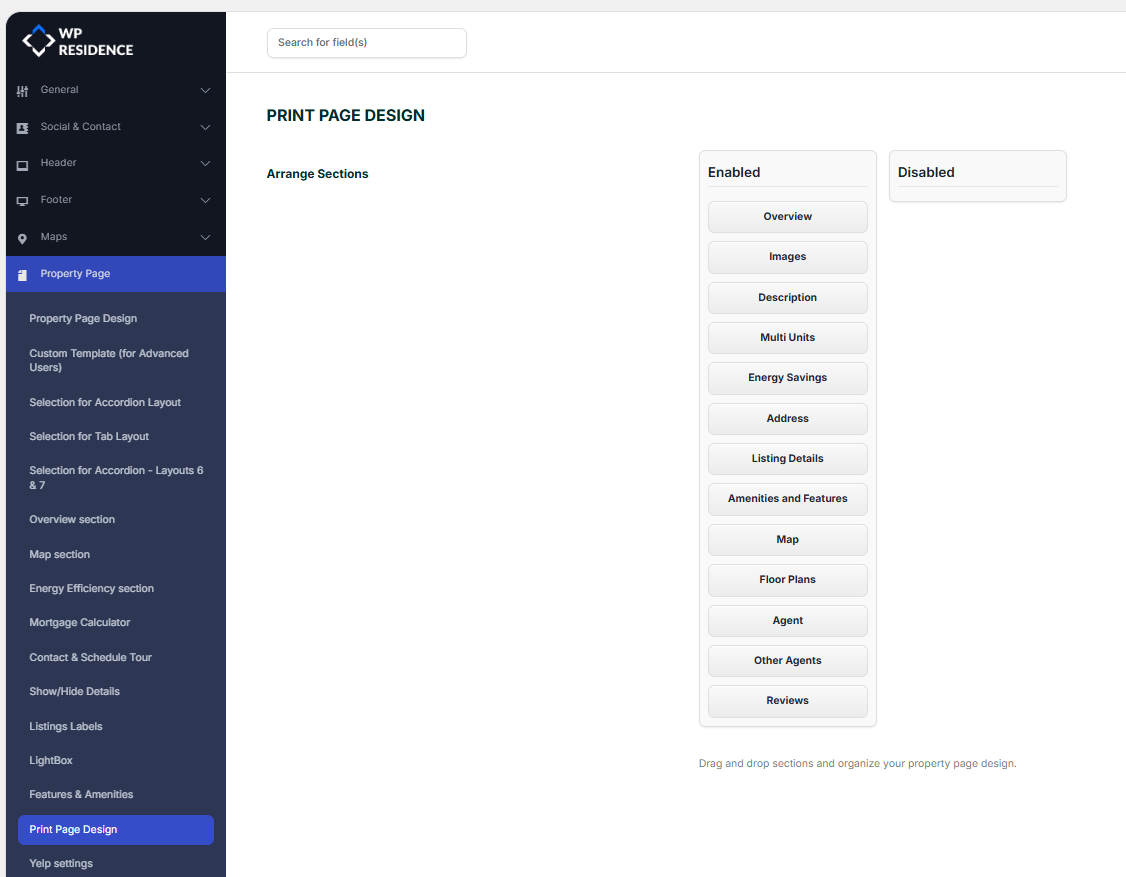
Print page design
This section controls the content and design used when printing a property page or generating its PDF view.
Help: Print and PDF management
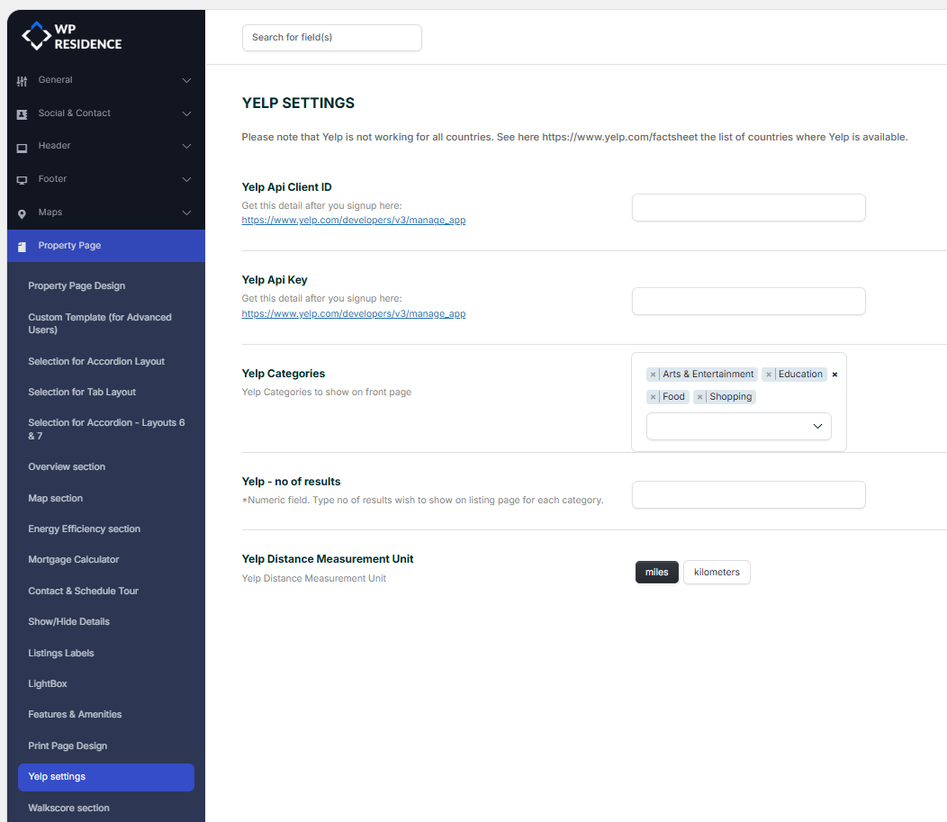
Yelp settings
This section controls the Yelp API integration used for nearby places and related location information.
Help: Yelp API integration
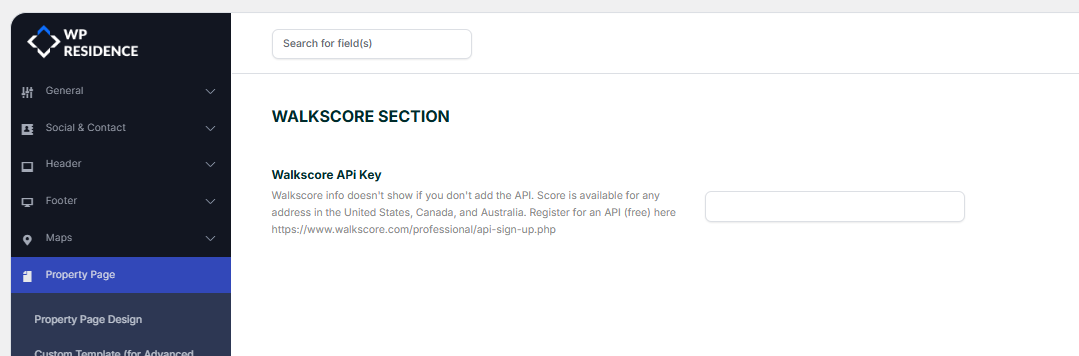
WalkScore API key
This section lets you add the WalkScore API key used to display walkability information for listings.
You can request an API key here: WalkScore API sign up
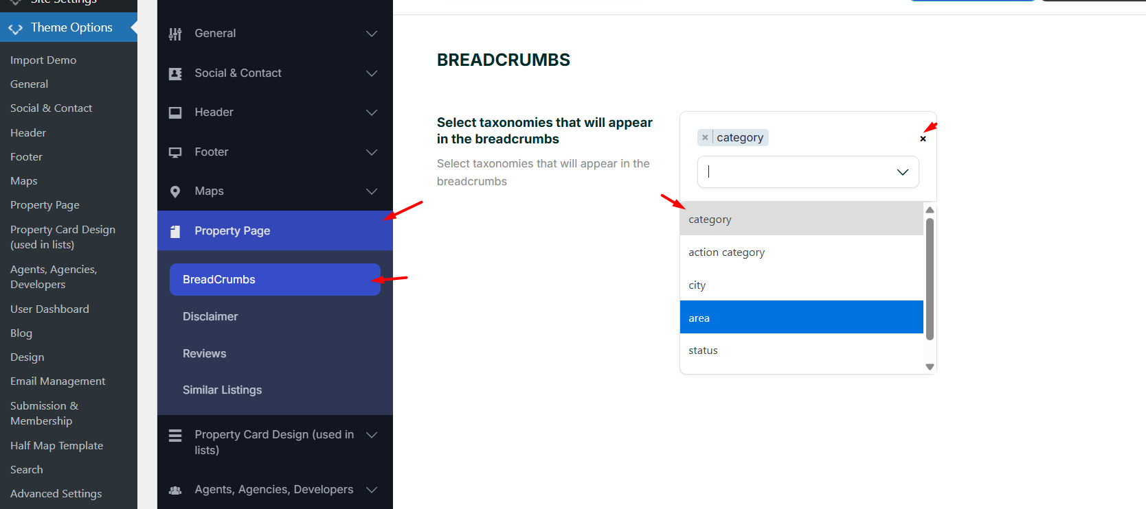
Breadcrumbs
The breadcrumbs shown on property pages can be customized separately from:
Theme Options > Property Page > Breadcrumbs
Use this section to control how the breadcrumb path is built for property pages.
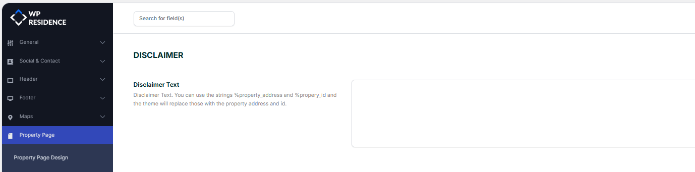
Disclaimer
This section lets you add or manage the disclaimer text shown on the property page.
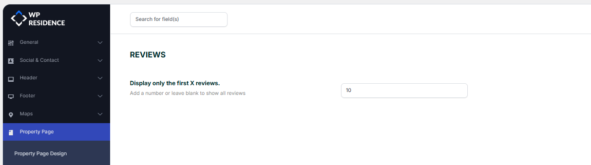
Reviews
This section controls the review feature shown on the property page, including whether reviews are enabled in the default property template.
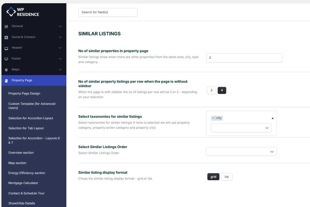
Similar listings
This section controls the similar listings block shown at the bottom of the single property page.
Help: Similar posts and similar properties