Footer Settings and Customization
You can choose to either:
- Create a fully custom footer using the WpResidence Design Studio. Follow this guide:
How to Create Custom Header/Footer with Header Footer Builder - Continue using the theme default footer options, as explained below.
How to Manage the Theme Default Footer
Navigate to Theme Options > General > Footer to access the footer settings. You will find the following configuration options:
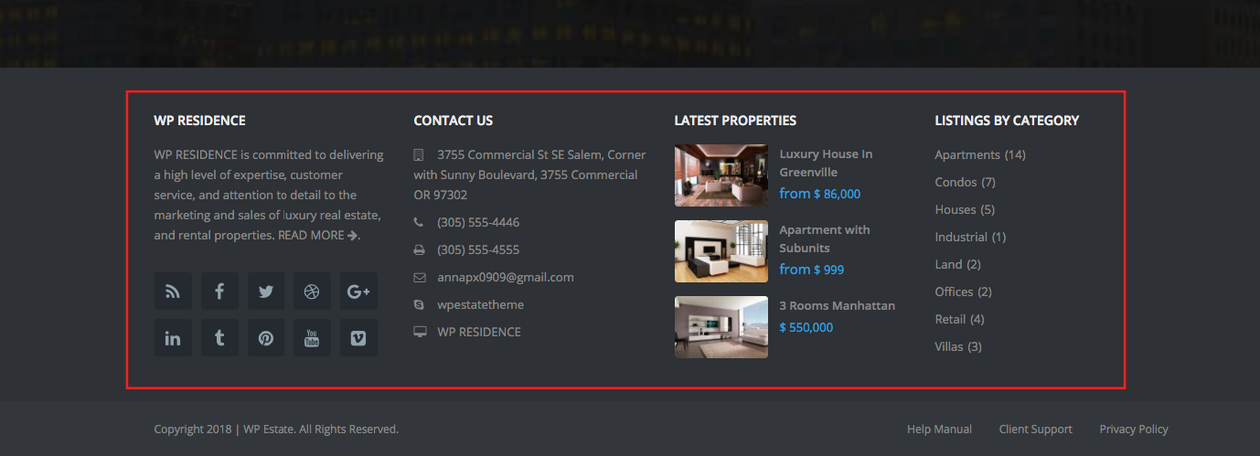
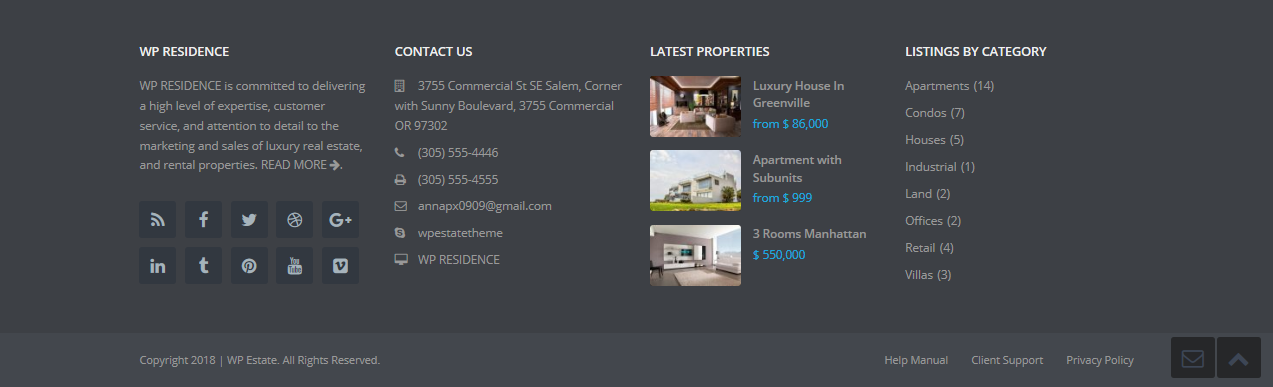
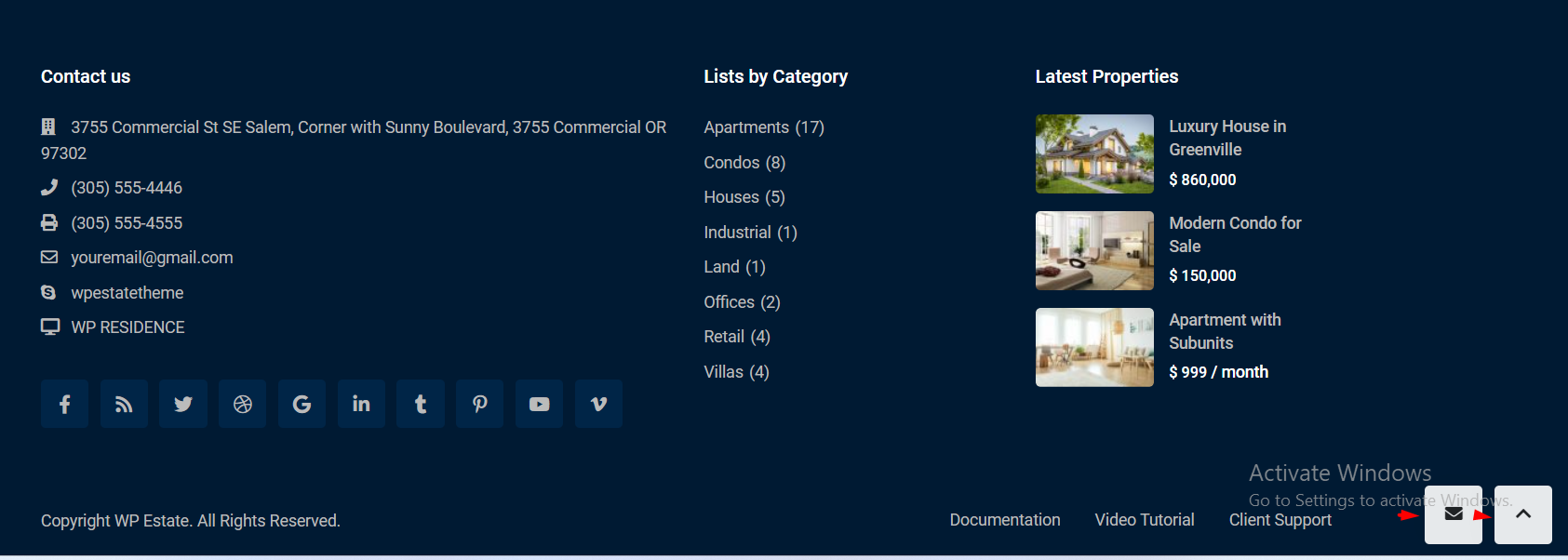
Footer Elements
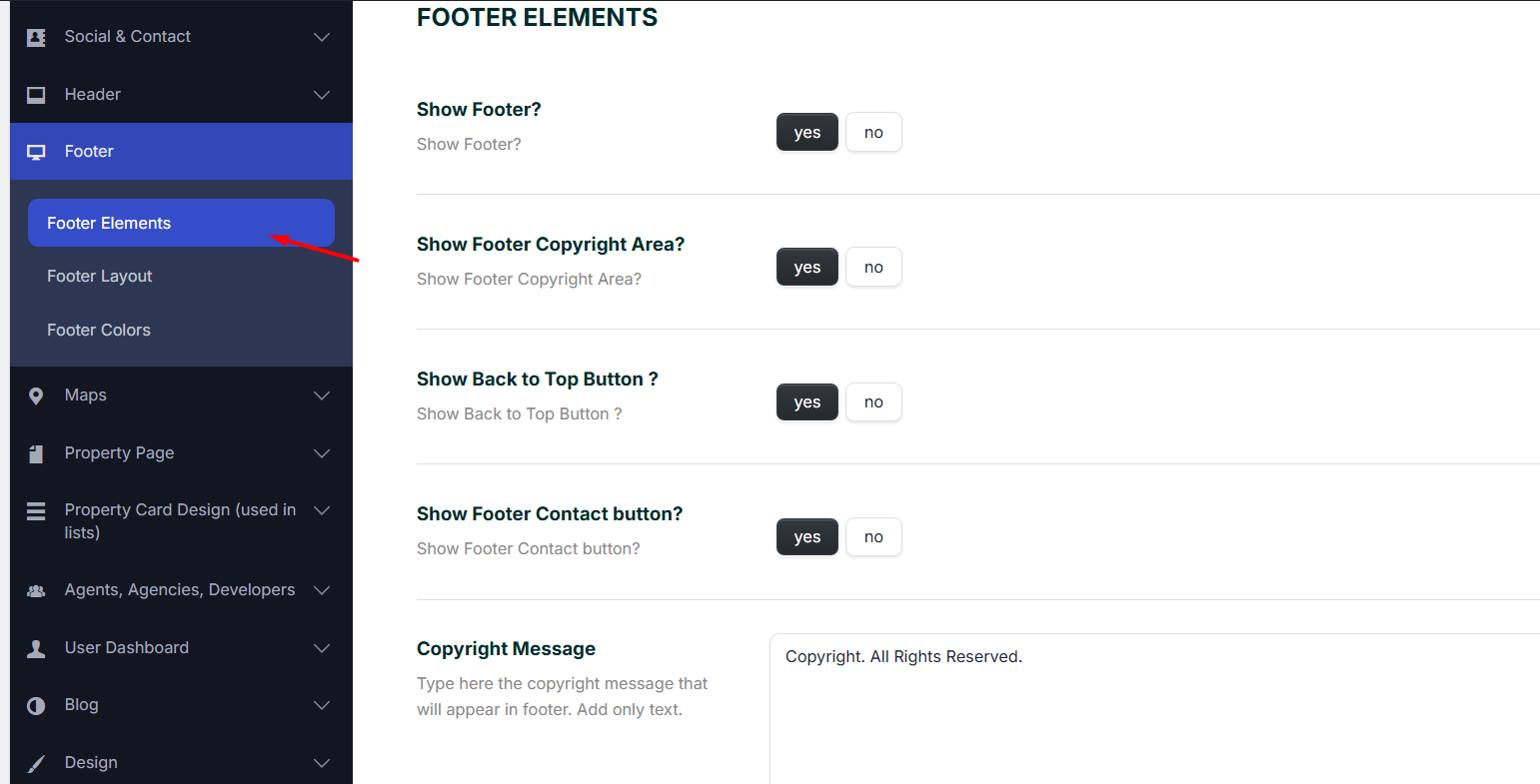
Show Footer? Yes/No
If yes, you must setup the widgets you wish to show on the top bar area.
Show Footer Copyright Area? Yes/No
If yes, you must:
- Type the copyright message that will appear in the footer in the Copyright Message option. The copyright message supports only TEXT, not links (HTML is stripped for security reasons).
Technical help article about how to add HTML in child theme - Save also a footer menu.
Help article about how to setup footer menu
Show Back to Top Button? YES/NO and Show Footer Contact button? YES/NO
The options will hide the buttons from the footer section.
Footer Layout
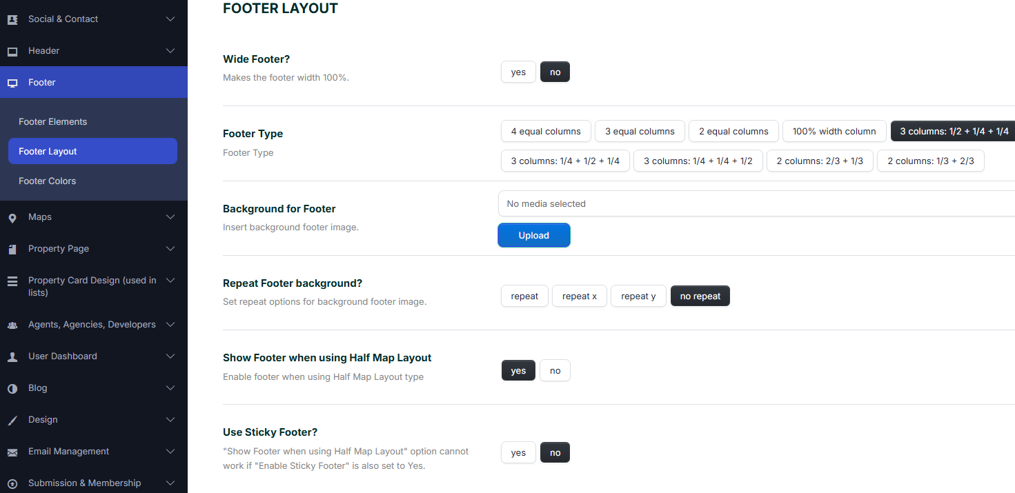
Wide Footer?
- Yes / No
- When set to Yes, the footer width stretches to 100% of the screen, ignoring container constraints.
- When set to No, the footer width is limited to the default boxed container.
Footer Type
Choose how many columns the footer should have and their relative widths. Available layouts:
- 4 equal columns – Four columns of equal width.
- 3 equal columns – Three columns of equal width.
- 2 equal columns – Two columns of equal width.
- 100% width column – One single full-width column.
- 3 columns: 1/2 + 1/4 + 1/4 – Three columns with a wide left column and two smaller right columns.
- 3 columns: 1/4 + 1/2 + 1/4 – Three columns with a wide middle column and two smaller side columns.
- 3 columns: 1/4 + 1/4 + 1/2 – Three columns with a wide right column.
- 2 columns: 2/3 + 1/3 – Two columns where the left column is wider.
- 2 columns: 1/3 + 2/3 – Two columns where the right column is wider.
Background for Footer
- Allows you to upload a custom background image for the footer area.
- Click Upload to select or upload an image from the media library.
Repeat Footer Background?
Controls how the background image is displayed:
- repeat – Repeats the image both horizontally and vertically.
- repeat x – Repeats the image only horizontally.
- repeat y – Repeats the image only vertically.
- no repeat – Displays the image once without repeating.
Show Footer when Using Half Map Layout
- Yes / No
- Enable this option to display the footer on pages using the Half Map layout.
- If disabled, the footer will be hidden on Half Map pages.
- The option also applies to footers created with WpResidence Design Studio.
Help Article
Use Sticky Footer?
- Yes / No
- When enabled, the footer will stick to the bottom of the browser window, regardless of content height.
Important: The “Show Footer when Using Half Map Layout” option does not work if “Enable Sticky Footer” is also set to Yes.
Footer Colors
These options let you control the main colors for the footer area.
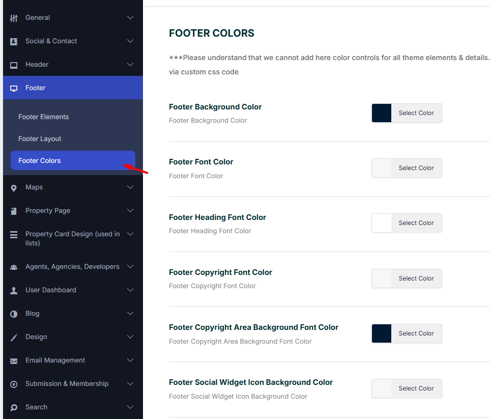
Footer Background Color
- Sets the background color of the entire footer area.
- Click Select Color to choose or input a custom color.
Footer Font Color
- Defines the default text color used in the footer content (paragraphs, links, etc.).
- Click Select Color to apply the desired text color.
Footer Heading Font Color
- Controls the color of heading elements (e.g., widget titles, section headings) in the footer.
- Click Select Color to pick a custom heading color.
Footer Copyright Font Color
- Sets the font color for the copyright text area.
- Click Select Color to customize.
Footer Copyright Area Background Font Color
- Controls the background color of the copyright area (the bar below the main footer).
- Click Select Color to apply.
Footer Social Widget Icon Background Color
- Changes the background color of the social icons displayed in the footer social widget.
- Click Select Color to customize.
Footer Social Widget Icon Color
- Sets the color of the actual social icons (e.g., Facebook, Twitter) in the footer.
- Click Select Color to select a custom icon color.
Managing Footer Widgets
The footer layout supports up to 4 widget columns, depending on the selected Footer Type (see Footer Layout settings).
How to Add Content to the Footer Columns
- Go to Admin > Appearance > Widgets.
- Locate the Footer Widget Areas (Footer Column 1, Footer Column 2, etc.).
- Use drag and drop to add widgets (e.g., text, menus, social icons) to each column.
- Save your changes.
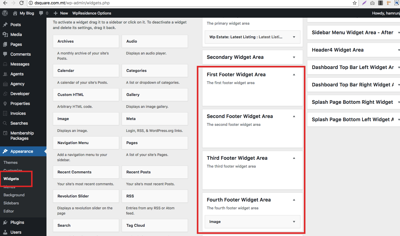
The widgets will be positioned in this area, above the copyright footer area.