This article explains how to manage the property card settings in WPResidence.
The property card controls how properties appear in lists, search results, taxonomy pages, and other property sections. You can manage the card type, images, content, agent row, phone and WhatsApp buttons, and other visible details.
Property Card General Settings
The general property card settings control the main layout and behavior of the property cards.
You can choose the card type, the list style, the number of cards per row, title length, excerpt length, and modal behavior for supported card types.
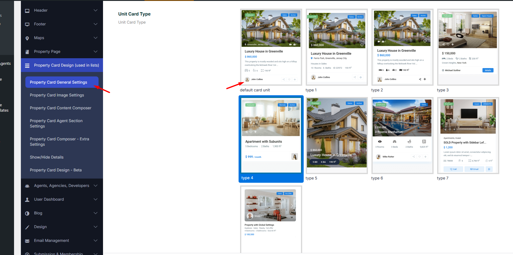
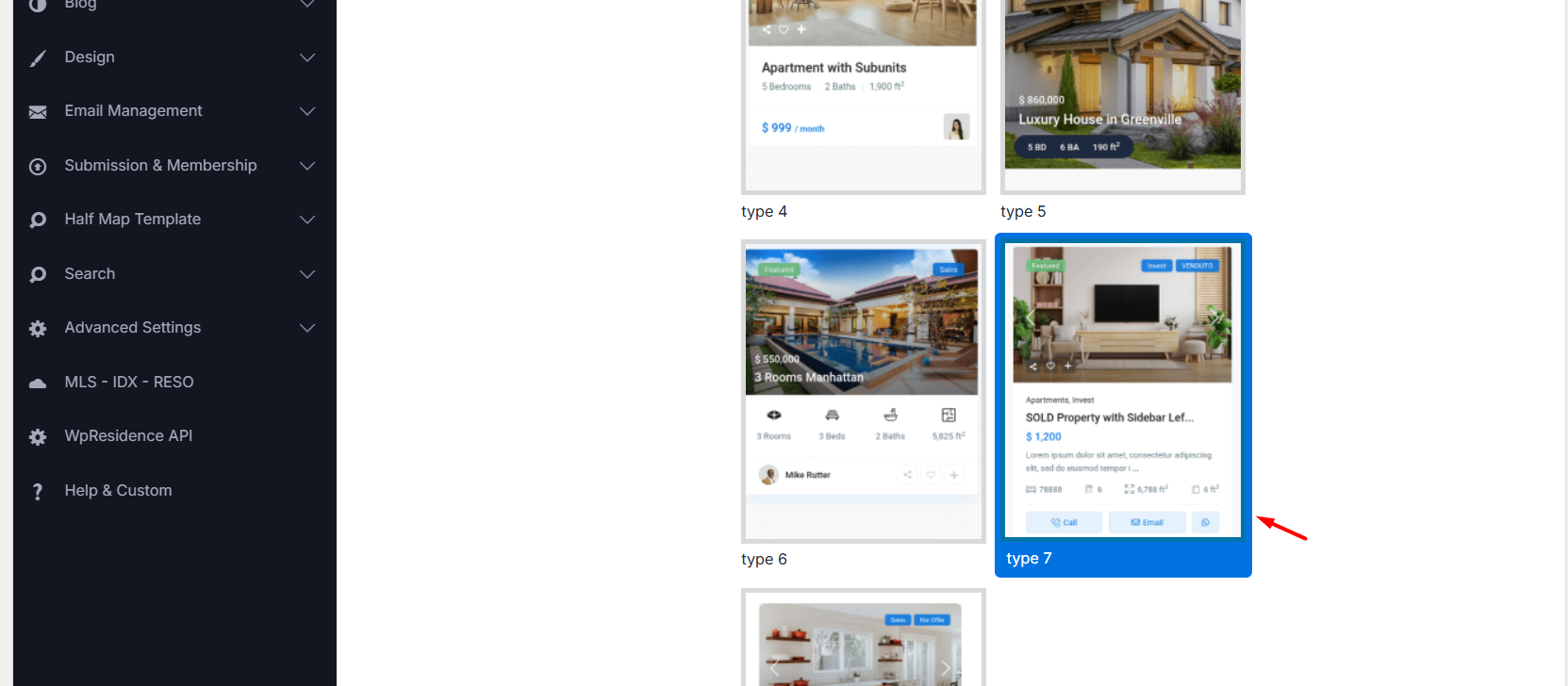
Card Type Selection
Choose the property card design used on your website.
Property List Display
Choose how properties are displayed on list pages.
- Grid shows properties in columns.
- List shows properties stacked one under another.
Number of Characters to Show in Property Title
Limit how many characters are shown from the property title. Leave this field blank if you want to show the full title.
Number of Characters to Show in Property Card Excerpt – Grid Style
Limit the property excerpt shown in grid style cards.
Number of Characters to Show in Property Card Excerpt – List Style
Limit the property excerpt shown in list style cards.
Click and Open Property Modal Window – Zillow Style
Enable this option if you want the property to open in a modal instead of opening the property page.
Open Title Link to Property Page in New Window
Enable this option if you want the property title link to open in a new browser tab.
Number of Property Listings per Row Without Sidebar
Choose how many property cards show on each row when the page does not use a sidebar.
Property Unit/Card Minimum Height
Set a minimum height for property cards. This can help keep cards aligned when titles, images, or details have different lengths.
Show Modal for the “Call” Action in Card Type 7
Enable this option if you want the Call button in Card Type 7 to open a modal.
Text for the “Call” Modal in Card Type 7
Use this field to control the text shown inside the Call modal.
Available placeholders:
- %property_id – Property ID
- %title – Property title
- %realtor_name – Realtor name
- %realtor_phone – Realtor phone
- %realtor_mobile – Realtor mobile
Allowed HTML:
- <br class=””> – New line
- <p class=””> – New paragraph
- <span class=””> – Custom styling
Example:
<p class="modal-title">%title</p>
<p>Contact: %realtor_name</p>
<p>Phone: %realtor_phone<br>Mobile: %realtor_mobile</p>
Property Card Image Settings
These settings control the main image area of the property card.
The main card image is the property image. Depending on the card type and settings, it can use the property featured image, the first image from the property gallery, or the placeholder image if the property has no uploaded image.
You can enable the image slider and set placeholder images for properties that do not have uploaded images.
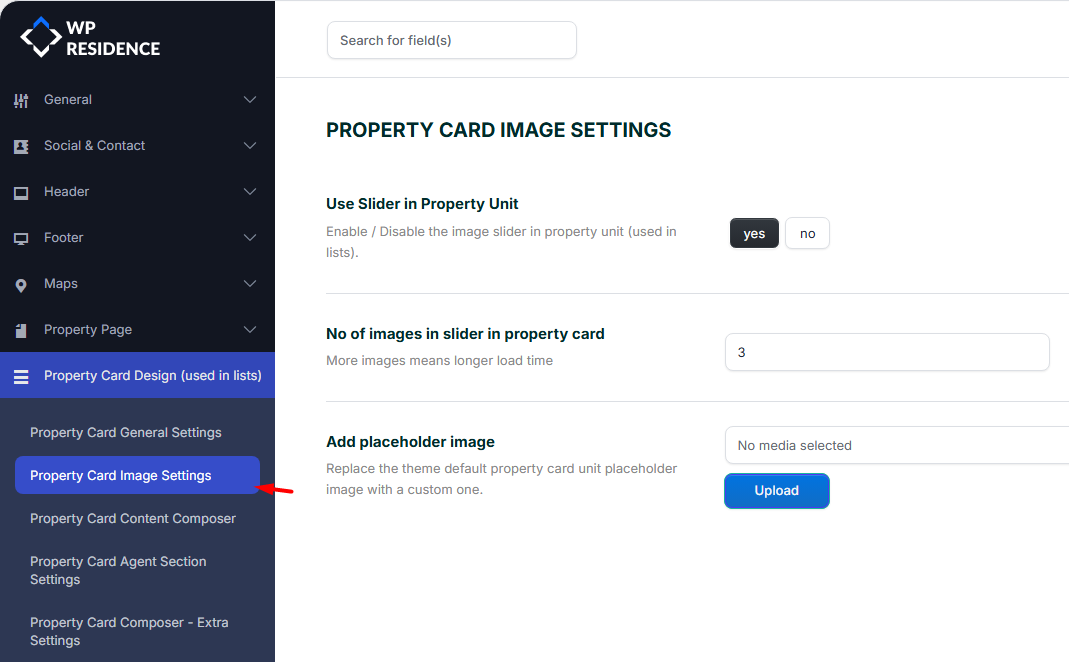
Enable Image Slider
Enable this option if you want property images to show as a slider on the property card.
Set Placeholder Images
Use placeholder images for properties that do not have their own images uploaded.
Property Card Content Composer
The Property Card Content Composer controls what information appears inside the property card.
You can choose which property details show on the card, including price, location, features, and custom fields.
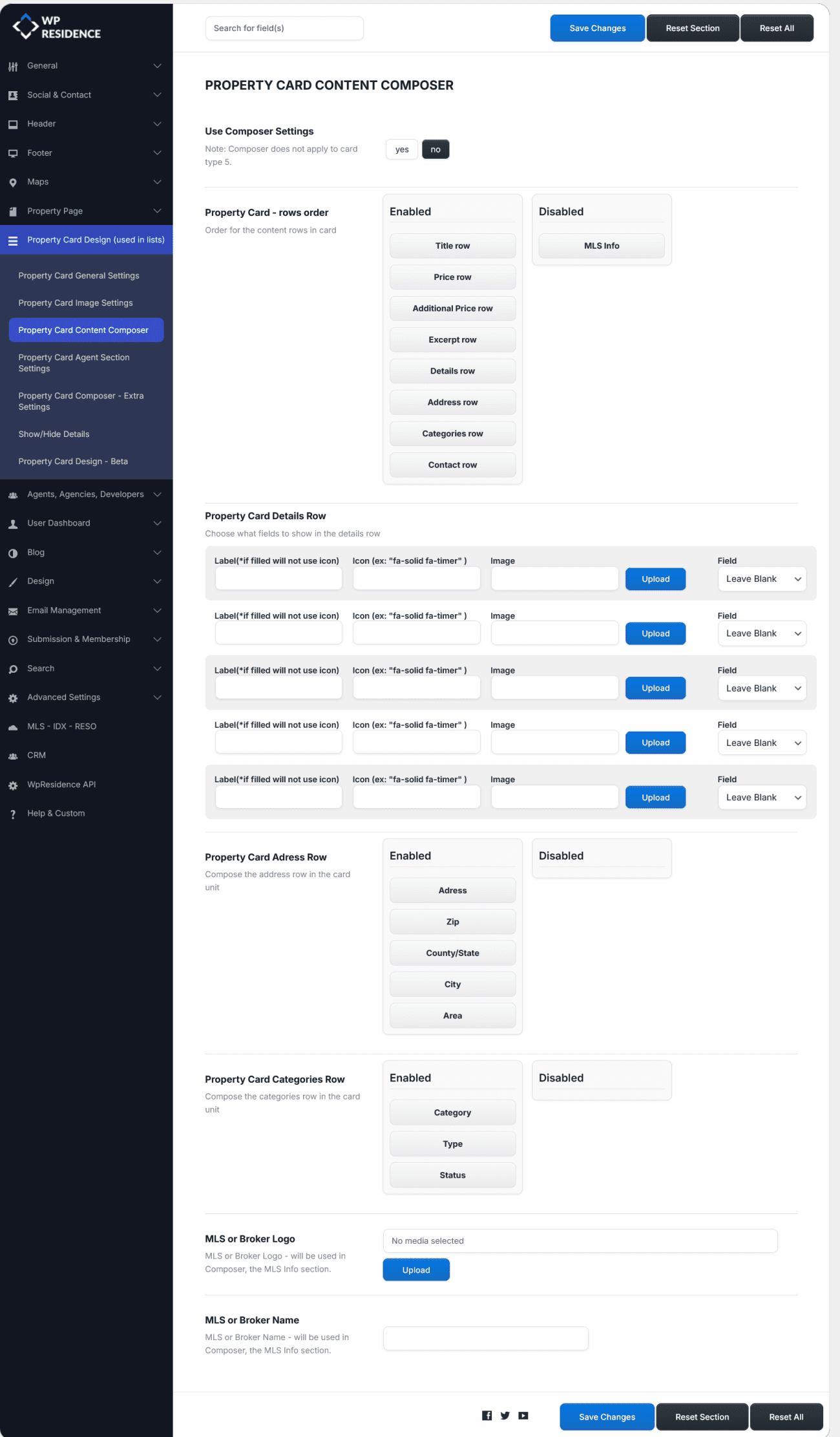
Use this section when you want to change the details shown on the card without editing theme files.
Property Card Agent Section Settings
These options control the agent row shown on the property card.
The agent row can show the agent image, name, and other agent details, depending on the selected property card design.
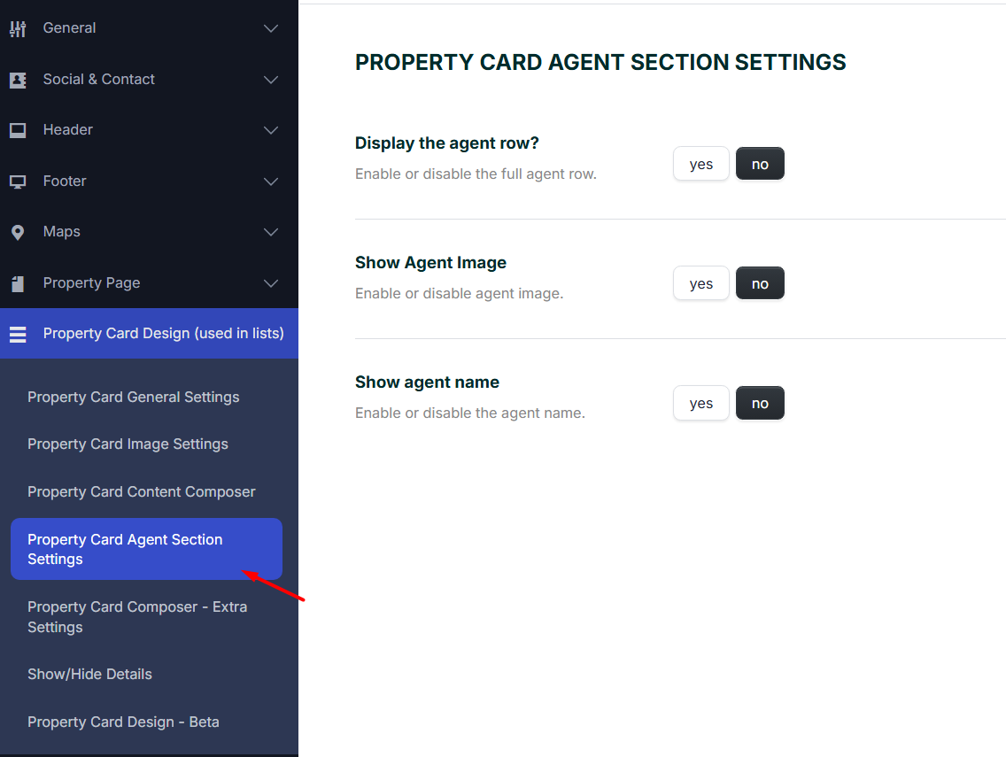
Display the Agent Row?
Enable or disable the full agent row on the property card.
- Yes shows the agent row.
- No hides the agent row.
Show Agent Image
Enable or disable the agent profile image on the property card.
- Yes shows the agent image if the property has an assigned agent and the agent has an image.
- No hides the small agent image from the property card.
Show Agent Name
Enable or disable the agent name on the property card.
- Yes shows the agent name.
- No hides the agent name.
When the Agent Image or Property Image Shows on the Card
Some property card designs show a small image over the main property image, usually in the bottom-left area of the card.
This small image is the agent image when the Agent section is enabled.
This is why the small preview image can look the same on multiple property cards. It can happen when:
- The properties do not have agents assigned.
- The same agent is assigned to all properties.
- The assigned agent does not have a profile image.
- The card is showing a fallback image because the agent image is missing.
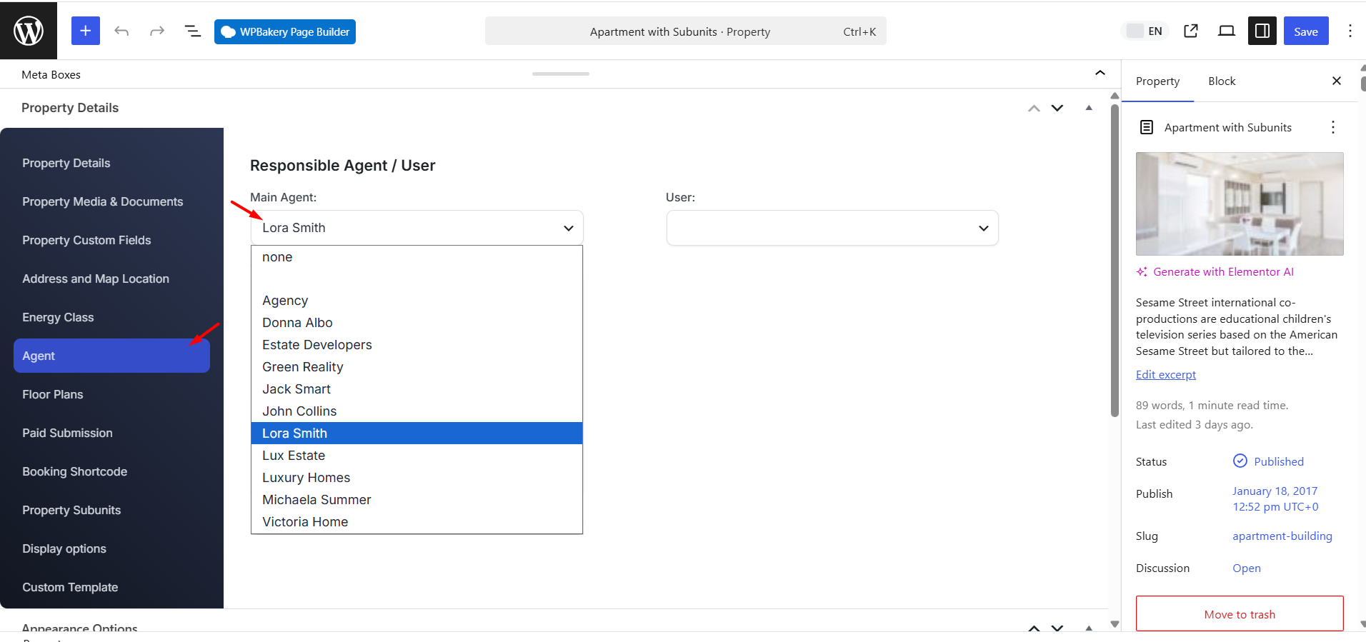
How to Assign an Agent so the Correct Agent Image Shows
If you want the agent image to show correctly on each property card, each property must have an agent assigned, and the agent must have a profile image.
Follow these steps:
- Go to Agents in wp-admin.
- Edit the agent profile.
- Add or check the agent profile image / featured image.
- Save the agent profile.
- Go to Properties > All Properties.
- Edit the property.
- Open the Agent tab.
- Assign the correct agent as the Main Agent for that property.
- Update the property.
- Clear cache and check the property card again.
After the property has an assigned agent with a profile image, the property card can show that agent image.
If you do not want to show the small agent image at all, disable it from:
Theme Options > Design > Property Card Design > Agent Section
Set Show Agent Image to No.
If you do not want to show the agent row at all, set Display the Agent Row? to No.
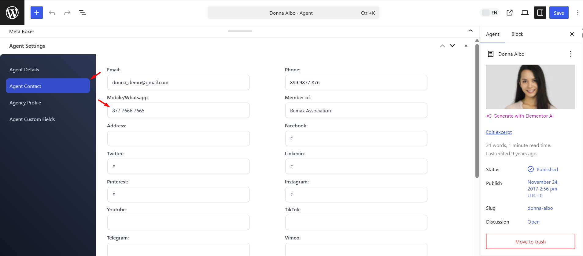
Card Type 7 – Add Phone and WhatsApp Buttons
Card Type 7 can show phone and WhatsApp actions on the property card.
These buttons do not use one global phone number from theme options. They use the contact details from the Main Agent assigned to each property.
To make the phone or WhatsApp button work:
- Go to Agents and edit the agent profile.
- Add the correct phone or mobile number.
- For WhatsApp, use a real WhatsApp number.
- Add the country code, for example +9715xxxxxxx.
- Avoid spaces and special characters if the WhatsApp link does not open correctly.
- Edit the property.
- Open the Agent tab.
- Set that agent as the Main Agent for the property.
After the property is linked to an agent with the correct contact details, the phone and WhatsApp buttons can use that agent number on the property card.
Property Card Composer Extra Settings
These options control extra design settings for the property card.
You can adjust font sizes, icon sizes, image dimensions, spacing, and other layout details.
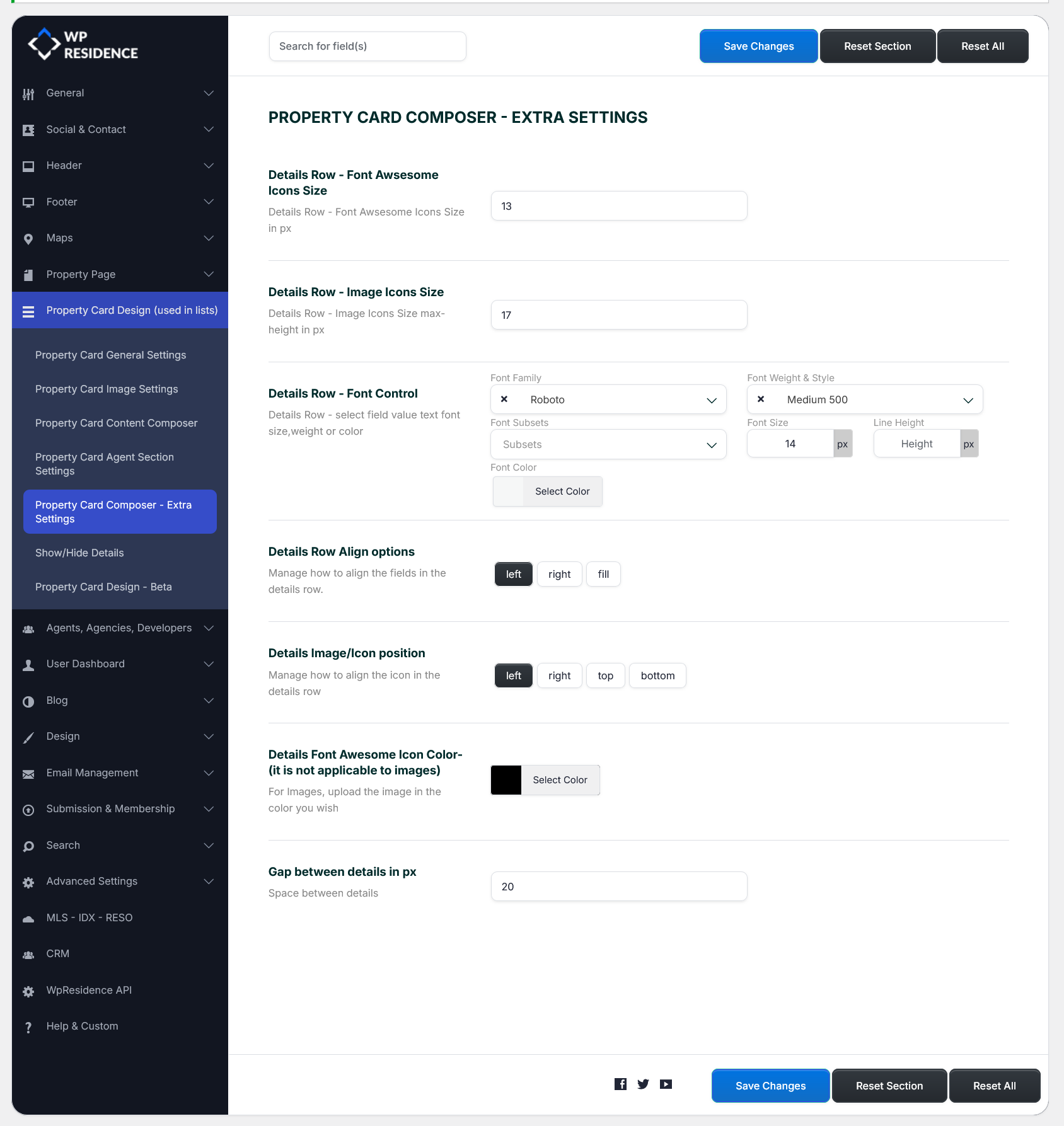
Use these settings when the card content is correct, but the design needs small layout adjustments.
Show or Hide Property Card Details
These settings control which extra buttons and labels show on the property card.
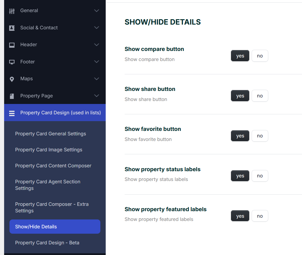
You can use this section to hide or show details such as:
- Compare button
- Share button
- Favorite button
- Property status labels, such as New, For Rent, or Sold
Important Notes
- The property card settings apply globally to property lists unless a page, shortcode, or custom widget uses separate settings.
- The main card image is the property image.
- The small image shown over the property card image is usually the agent image, if the agent section is enabled.
- If no agent is assigned to the property, the agent image cannot show and a property/fallback image can be used instead.
- If the same small image appears on several cards, check if the same agent is assigned, if agents are missing, or if the fallback image is being used.
- To show the correct agent image, assign a Main Agent to each property and add an image to the agent profile.
- To remove the small image, disable Show Agent Image from the property card Agent Section settings.
- To remove the full agent row, disable Display the Agent Row?.
- For Card Type 7 phone and WhatsApp actions, always check the agent assigned as Main Agent for the property.
- If the WhatsApp button does not work, check that the number exists in the agent profile and includes the correct country code.