Advanced Search Colors
The Advanced Search Colors settings allow you to control the visual appearance of the advanced search form across your website.
These options affect background colors, text colors, buttons, hover states, and category tabs, depending on the search type you are using.
You can find these settings in: WPResidence → Search → Advanced Search Colors
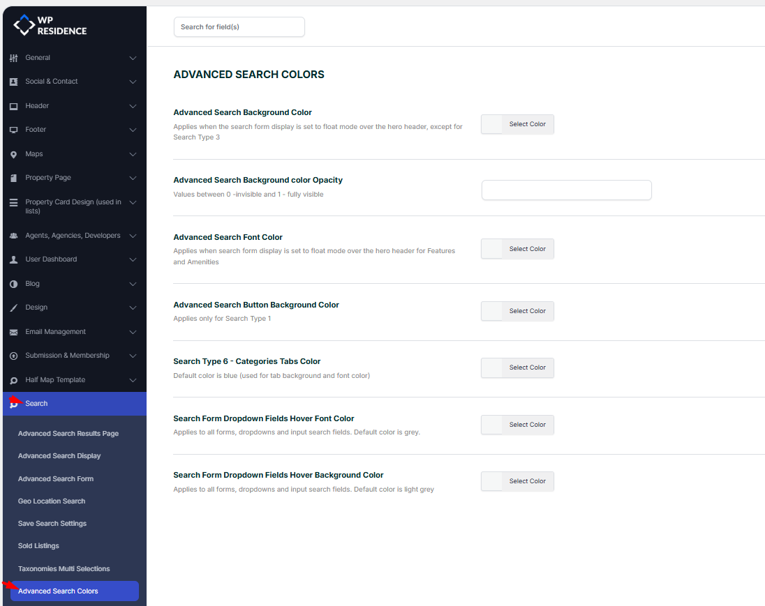
Advanced Search Background Color
Sets the background color of the advanced search form when the search display is set to float over the hero header.
This option applies to all search types except Search Type 3.
Help article for advanced search form display
Advanced Search Background Color Opacity
Controls the transparency level of the advanced search background color.
Accepted values:
- 0 = fully transparent
- 1 = fully visible
Using a value between 0.7 and 0.9 is recommended if you want the hero image to remain slightly visible behind the search form.
Advanced Search Font Color
Defines the text color used inside the advanced search form when it is displayed in floating mode over the hero header.
This color is mainly used for features and amenities labels to ensure readability over background images.
Advanced Search Button Background Color
Sets the background color of the search button.
This option applies only to Search Type 1.
If you are using a different search type, this setting will not affect the button.
Help article for how to setup price slider on the search form
Help article for how to set up features and amenities on the search form
Search Type 6 – Categories Tabs Color
Controls the color of category tabs used in Search Type 6.
This color is applied to both:
- Tab background
- Tab text
The default color is blue.
Search Form Dropdown Fields Hover Font Color
Sets the text color when hovering over dropdown fields and input fields in the search form.
This setting applies to all search forms.
The default hover font color is grey.
Search Form Dropdown Fields Hover Background Color
Controls the background color shown when hovering over dropdown options and input fields.
This setting applies to all search forms.
The default hover background color is light grey.
Practical Usage Notes
If your search form is placed over a hero image, always test contrast between background color, opacity, and font color.
Poor contrast can make the search difficult to use.
For best results:
- Use darker backgrounds with light text when overlaying images
- Avoid very low opacity values if the hero image is visually busy
- Test hover colors to ensure dropdowns remain readable
After making changes, always click Save Changes and refresh the front-end page to see the updated styles.
Elementor Search Form Builder note: When you use the Elementor Search Form Builder widget on specific pages, the Search button styling (colors, padding, border, typography, and alignment) is controlled from the widget’s Style tab, so you can adjust the button appearance and position directly there. Help – https://help.wpresidence.net/article/property-search-form-builder-for-elementor/