What General Design Settings control
The General Design Settings panel controls several global design options for the WPResidence layout.
These settings affect the general site container, content width, content padding, breadcrumbs, border radius, and shadow style used for theme elements such as property units, agent units, and blog units.
Where to find the settings
To manage these options, go to:
Theme Options > Design > General Design Settings
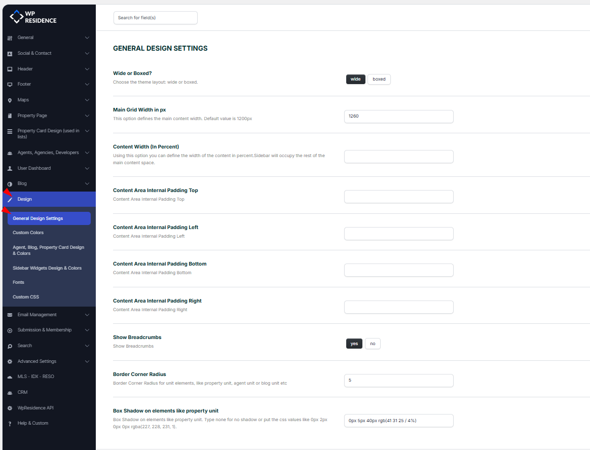
Wide or Boxed layout
This option controls the main website layout.
- Wide: the website layout stretches across the browser width.
- Boxed: the website layout is contained inside a fixed-width box.
Use Wide for a full-width modern layout.
Use Boxed if you want the website content to stay inside a fixed container, often with a background visible around it.
Main Grid Width in px
The Main Grid Width in px option defines the maximum width of the main content container.
Default value:
1200px
In the screenshot example, the value is set to:
1260px
Use this setting only if you need to customize the main content width. If you do not need a custom layout width, leave the default theme value.
Content Width in percent
The Content Width (In Percent) option defines the width of the main content area when a sidebar is used.
The sidebar will use the remaining available space.
For example, if the content width is set to 70, the main content area uses 70% and the sidebar uses the remaining space.
This option is useful for layouts that use sidebars. If your pages do not use sidebars, you can leave this field empty.
Content Area Internal Padding
The content area internal padding options control the spacing inside the main content area.
You can set padding for each side:
- Content Area Internal Padding Top
- Content Area Internal Padding Left
- Content Area Internal Padding Bottom
- Content Area Internal Padding Right
Add the value as a number, in pixels.
For example, adding 20 will apply 20px padding.
Leave the fields empty if you want to use the default theme spacing.
These controls apply to content areas such as property posts sections (Details, Features, etc), agent posts, and blog posts.
Show Breadcrumbs
The Show Breadcrumbs option enables or disables breadcrumb navigation.
- Yes: breadcrumbs are displayed.
- No: breadcrumbs are hidden.
Breadcrumbs help visitors understand where they are on the website and navigate back to parent pages or categories.
The homepage does not show breadcrumbs because it is the main index page of the website.
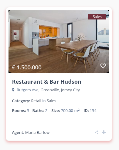
Border Corner Radius
The Border Corner Radius option controls the roundness of corners for theme elements.
This can apply to elements such as:
- Property units
- Agent units
- Blog units
Example values:
- 0: sharp corners
- 5: slightly rounded corners
- 20: more rounded corners
Add the value as a number, in pixels.
Box Shadow on elements
The Box Shadow on elements like property unit option lets you add a shadow effect to theme cards and units.
This can be used to add depth to property units, agent units, and blog units.
Example values:
- none: no shadow
- 0px 2px 8px rgba(0,0,0,0.12): small shadow
- 0px 5px 40px rgba(41,31,25,0.4): larger soft shadow
If you do not want any shadow, leave the field empty or use none.
The Border Corner Radius and Box Shadow settings work for property units, agent units, and blog units.