What the Navigation Menu Widget Does
The Navigation Menu widget is used inside a custom header created with WPResidence Studio Templates and Elementor.
This widget displays a WordPress menu in the custom header. It also lets you control the main menu style, desktop dropdown menu, mobile dropdown menu, and mobile toggle button directly from Elementor.
When to Use This Widget
Use the Navigation Menu widget when you want to replace the default WPResidence header with a custom header.
A custom header is useful when you want to control the header layout with Elementor, for example:
- Custom logo position
- Custom menu position
- Custom phone number, icons, buttons, or user menu
- Different header layout for desktop and mobile
- Custom menu colors, spacing, dropdown style, and mobile menu design
Create the Menu First
The Navigation Menu widget does not create menu items.
The menu items must be created first in Appearance > Menus.
From this section you can:
- Create a new menu
- Add pages, custom links, property pages, or other menu links
- Create dropdown items by placing menu items under a parent menu item
- Save the menu
After the menu is created, you can select it inside the Navigation Menu widget.
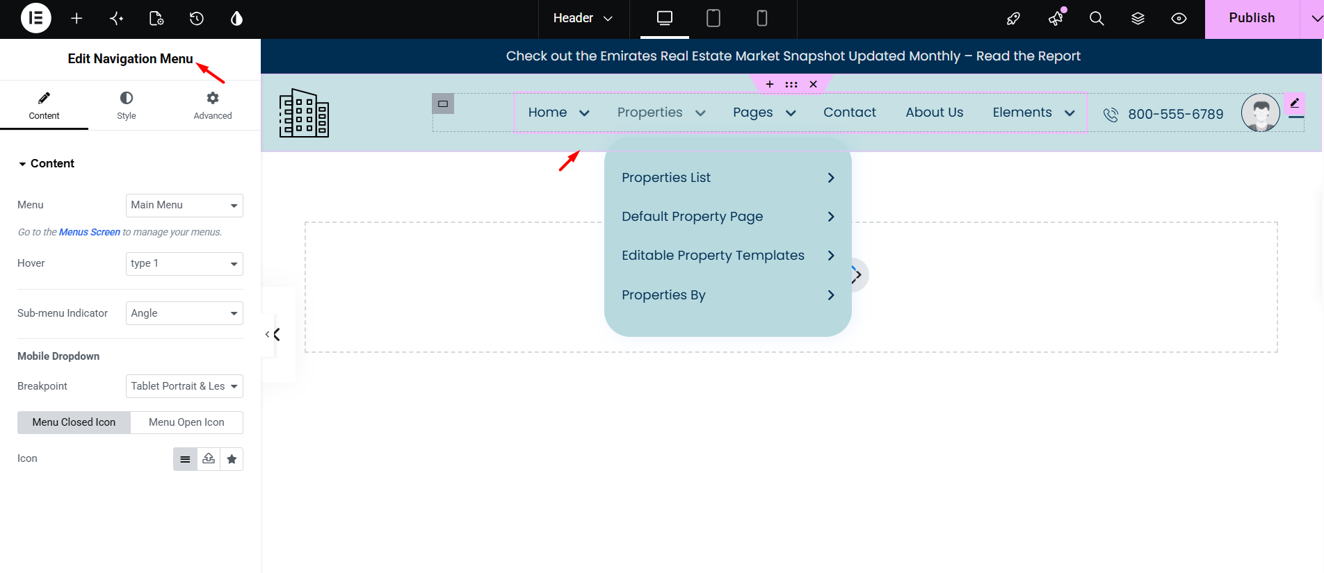
Content Settings
Open the Content tab of the Navigation Menu widget.
From this section you can control the menu source and mobile behavior.
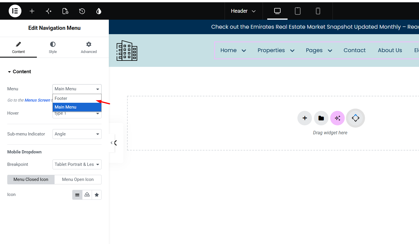
Menu
Select the WordPress menu you want to show, for example Main Menu.
The available menus are the menus created in Appearance > Menus.
Hover
Select the hover style used for the menu items.
Sub-menu Indicator
Choose the icon used for menu items that have submenus, for example Angle.
Mobile Dropdown
This section controls when the menu switches from desktop menu to mobile menu.
You can set the Breakpoint, for example Tablet Portrait & Less. When the screen reaches this size, the desktop menu is replaced by the mobile toggle menu.
You can also select the Menu Closed Icon and Menu Open Icon.
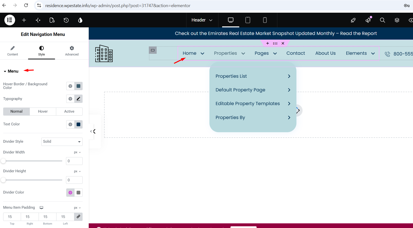
Style the Main Menu
Go to Style > Menu.
This section controls the main menu links shown in the header, such as Home, Properties, Pages, Contact, About Us, and other top-level menu items.
You can manage:
- Text Color for normal, hover, and active states
- Hover Border / Background Color
- Typography, including font family, size, weight, and line height
- Divider Style, width, height, and color
- Menu Item Padding
The Typography and Menu Item Padding options are important because they control how much space the main menu uses inside the header.
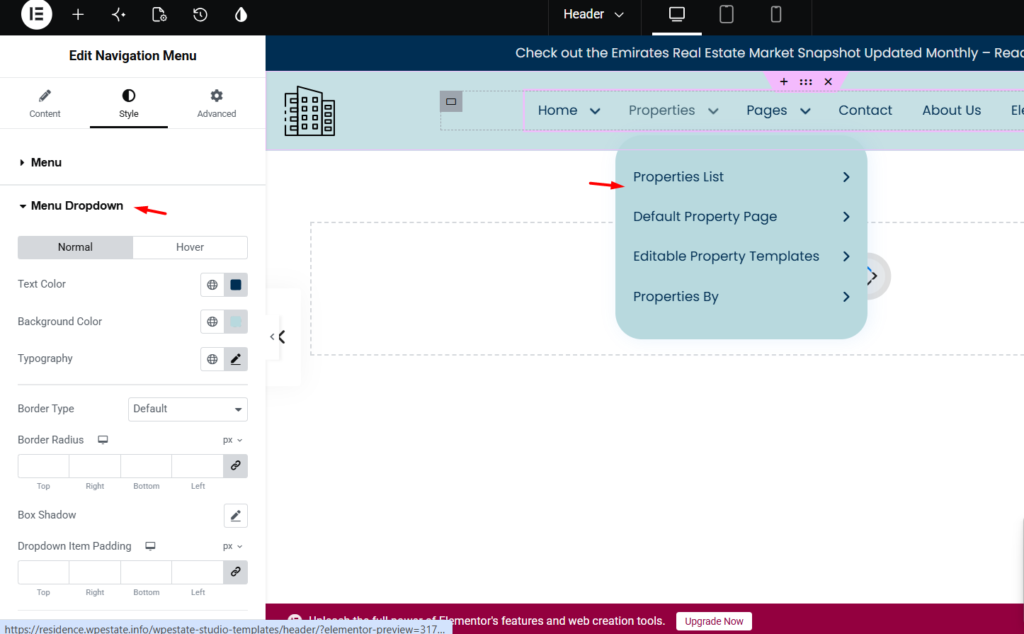
Style the Desktop Dropdown Menu
Go to Style > Menu Dropdown.
This section controls the submenu that opens under a parent menu item on desktop.
You can manage:
- Text Color
- Background Color
- Typography
- Border Type
- Border Radius
- Box Shadow
- Dropdown Item Padding
Use this section to style the dropdown background, submenu text, spacing inside submenu items, border radius, and shadow.
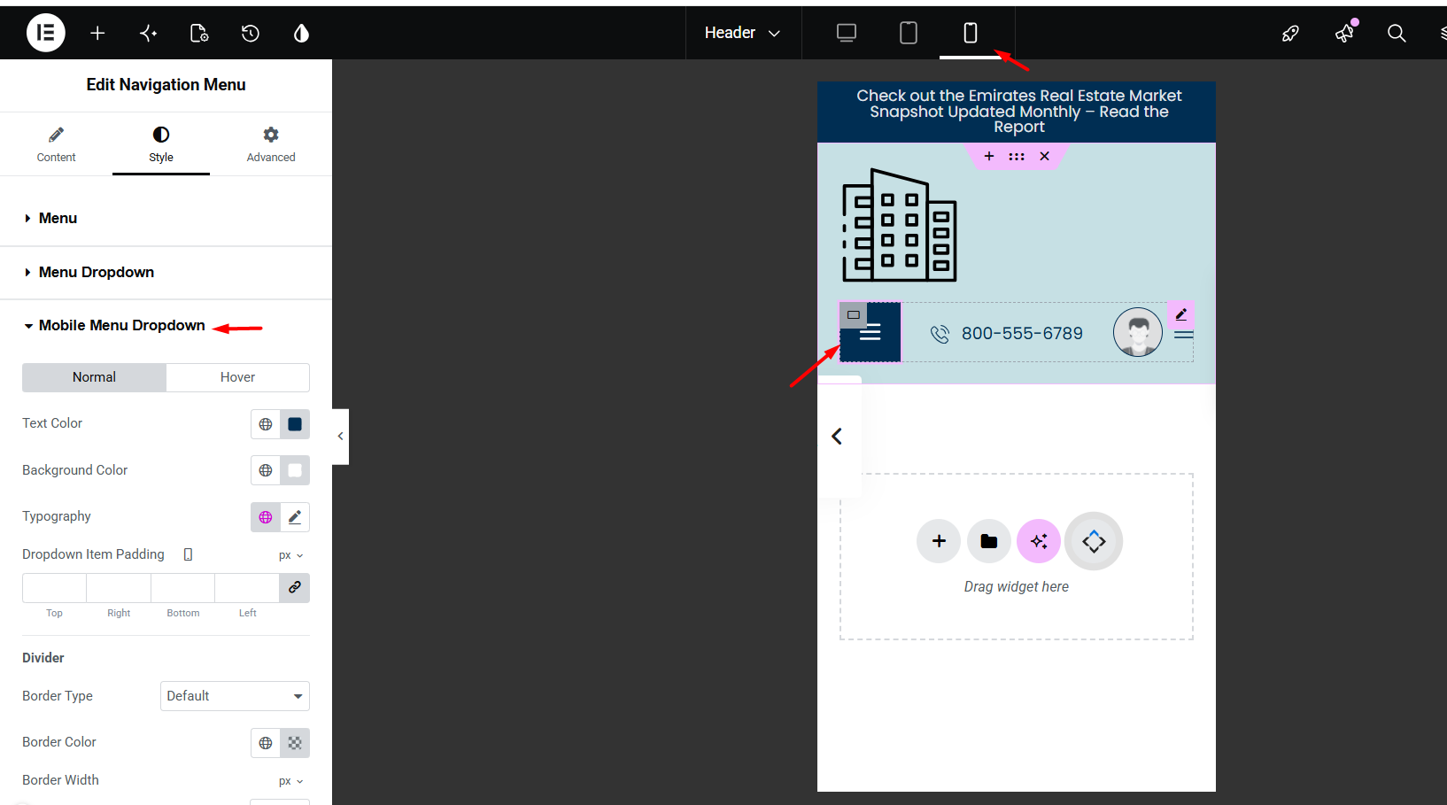
Style the Mobile Menu Dropdown
Go to Style > Mobile Menu Dropdown.
This section controls the dropdown shown after clicking the mobile menu icon.
You can manage:
- Text Color
- Background Color
- Typography
- Dropdown Item Padding
- Divider
- Border Type, border color, and border width
These settings apply to the mobile dropdown only. They do not change the desktop dropdown menu.
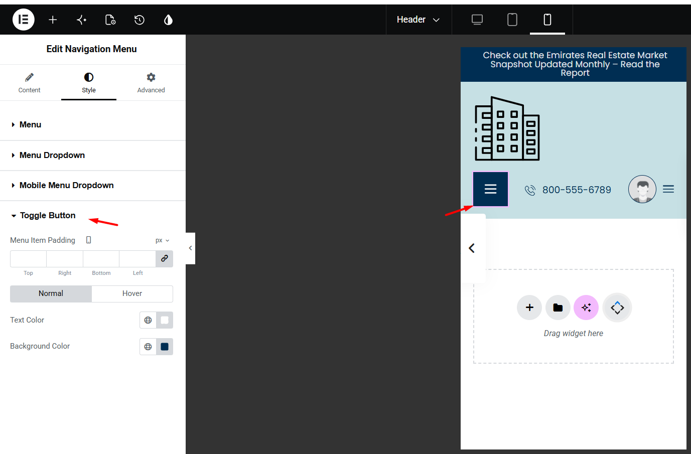
Style the Mobile Toggle Button
Go to Style > Toggle Button.
This section controls the mobile hamburger/menu button.
You can manage:
- Menu Item Padding
- Text Color
- Background Color
- Hover Text Color
- Hover Background Color
Use this section to change the icon color, background color, spacing, and hover design of the mobile menu button.
Fix Submenu Disappearing on Hover
If the submenu disappears when you move the mouse from the main menu item to the dropdown, there is usually too much space between the main menu and the submenu.
The submenu stays open only while the mouse is inside the menu hover area. If there is a gap between the parent menu item and the submenu, the mouse leaves the hover area and the submenu closes before the user can reach it.
To avoid this, check these settings:
- Edit the custom header with Elementor.
- Select the Navigation Menu widget.
- Go to Style > Menu.
- Open Typography and check the Line Height.
- Reduce the line height if it creates too much vertical space.
- Check Menu Item Padding in Style > Menu.
- Check the header section or container padding and margin.
- Check that the Navigation Menu widget does not have extra margin in the Advanced tab.
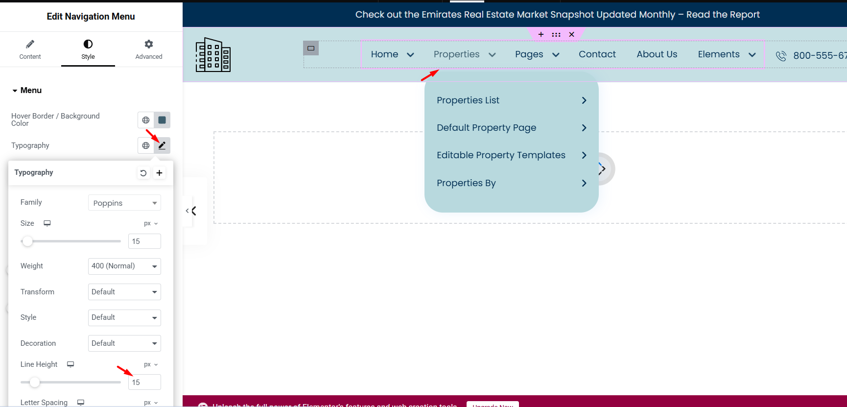
The Line Height option in Style > Menu > Typography can create extra vertical space between the main menu and the dropdown. If the line height is too large, the submenu can appear lower and may disappear when hovering.
The Dropdown Item Padding option controls the spacing inside the dropdown items. It does not fix the gap between the main menu and the submenu.
Also check the custom header layout itself. Extra bottom padding, margin, or height added to the row, container, column, or widget can push the dropdown too far from the main menu.
Test Desktop, Tablet, and Mobile
After you finish the menu setup, test the header in Elementor responsive mode and on the live website.
Check:
- Desktop menu layout
- Desktop submenu hover behavior
- Tablet breakpoint
- Mobile toggle button
- Mobile dropdown design
- Menu text size and spacing
The desktop menu, desktop dropdown, mobile dropdown, and mobile toggle button have separate style controls.
After making changes, click Publish or Update, then clear cache and test again on the front end.
Related Help
Create and manage custom header templates:
https://help.wpresidence.net/article/how-to-create-custom-header-footer-with-header-footer-builder/
Default Header vs Custom Elementor Header:
Manage WordPress menus in WPResidence: