Property Slider V1 for Elementor
The Property Slider V1 widget lets you display selected properties in a polished featured slider layout in Elementor.
This widget includes 2 design types:
- 1 – Editorial – a new, modern layout with a more polished featured presentation
- 2 – Classic – a more traditional slider layout
This widget is useful when you want to:
- show a curated set of selected listings
- build a homepage hero property section
- highlight featured listings in a more visual way
- display only the properties you choose by ID
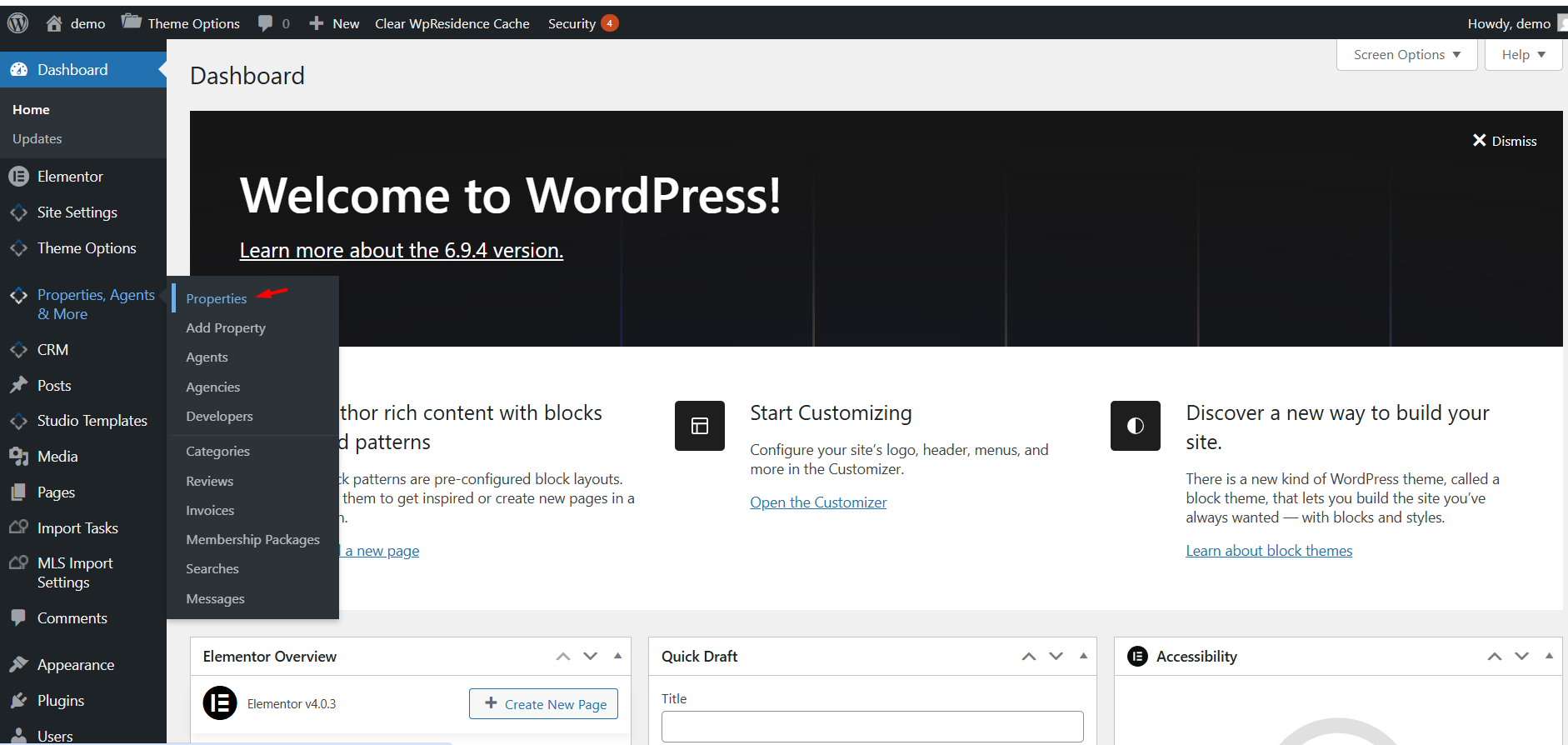
How to open and edit the slider with Elementor
To work with Property Slider V1, first edit the page with Elementor.
- Go to the page where you want to add the slider.
- Click Edit with Elementor.
- Search for the property slider widget in the Elementor panel.
- Add the widget to the page.
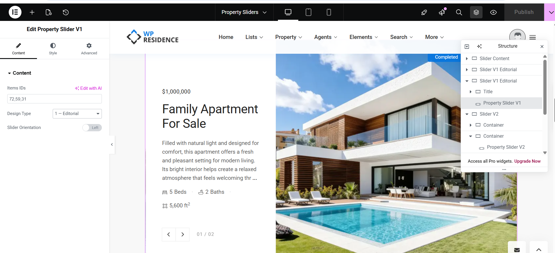
In the screenshots, the widget title in Elementor is Edit Property Slider V1.
How to add the Property Slider V1 widget
After opening the page in Elementor:
- Add the Property Slider V1 widget to the page.
- In the Content tab, add the property IDs you want to show.
- Select the Design Type.
- If you use the Editorial design, choose the Slider Orientation.
- Use the Style tab to customize the layout and colors.
- Publish or update the page when finished.
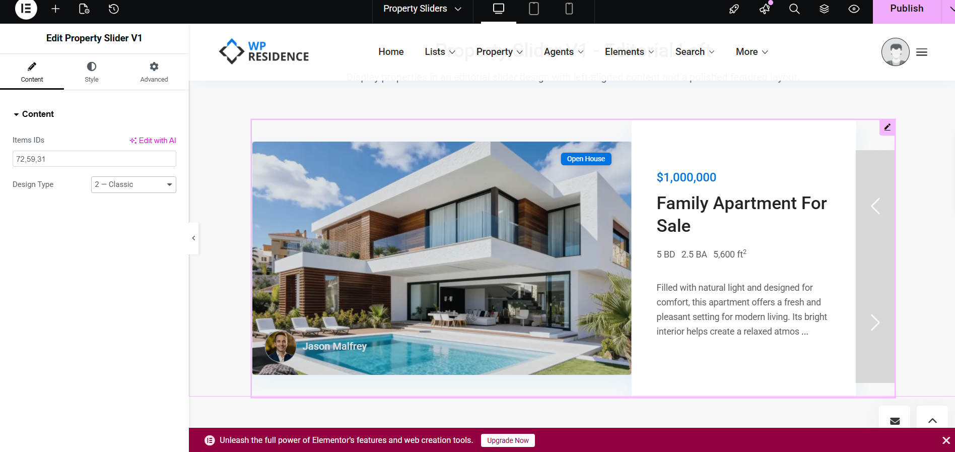
Content tab settings
The Content tab includes the main slider setup fields.
Items IDs
This field is required. Add the numeric property IDs of the listings you want to show in the slider.
If you want to display multiple listings, add the IDs as a comma-separated list.
Example:
72,59,31
These are the properties that will appear in the slider.
Design Type
This option lets you choose the visual style of the slider.
Available options are:
- 1 – Editorial
- 2 – Classic
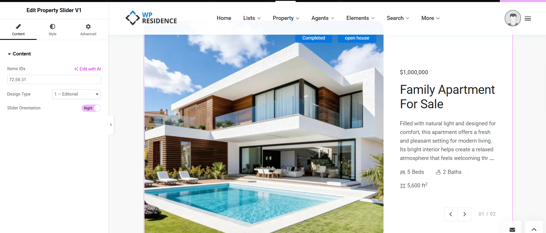
Slider Orientation
This option is used with the Editorial design type.
It controls which side shows the text content and which side shows the image.
Available options are:
- Left
- Right
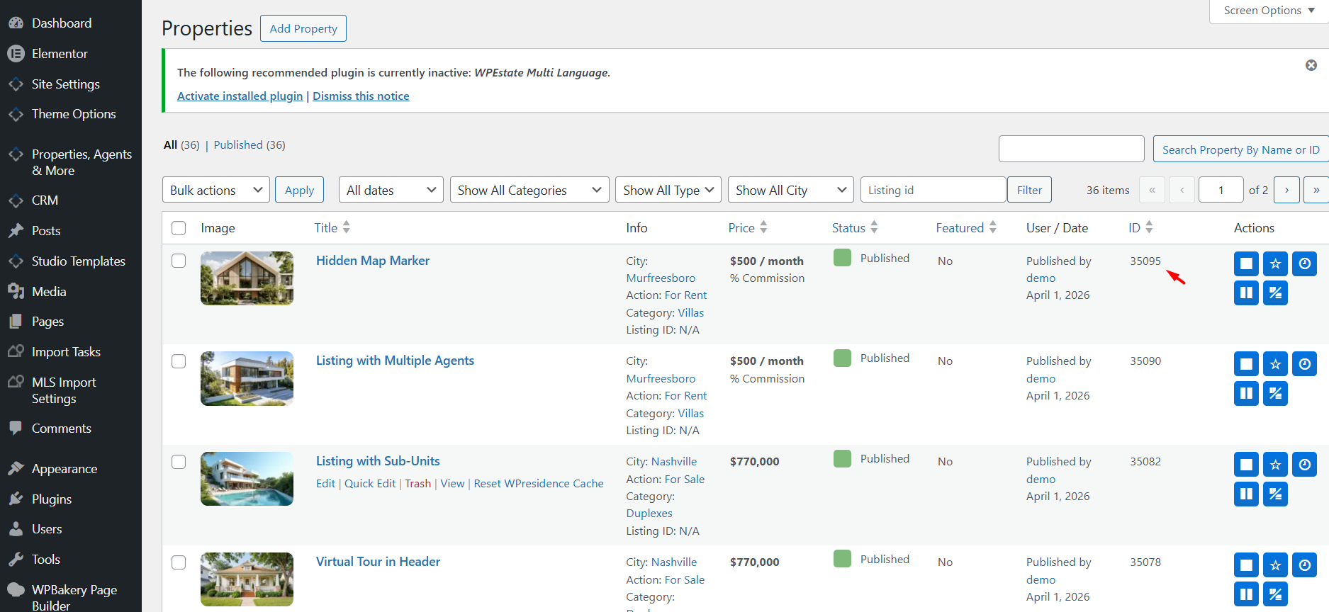
How to get the Property IDs correctly
To use the slider correctly, you need the numeric WordPress Property IDs of the listings you want to display.
- Go to Properties, Agents & More > Properties in wp-admin.
- Open the properties list.
- Look for the ID column on the right side of the list table.
- Copy the numeric ID of each property you want to include.
- Add those IDs in the Items IDs field in the widget.
Design types
Property Slider V1 includes 2 design variations.
The first is the newer and more modern Editorial layout. The second is the more traditional Classic layout.
Design Type 1 – Editorial
Design Type 1 – Editorial is the new, modern version of Property Slider V1.
This design uses a more polished featured layout with a large image area and a dedicated content panel for price, title, description, meta, and slider navigation.
It is a good choice when you want:
- a premium homepage hero section
- a more editorial and modern layout
- a cleaner separation between image and content
- a polished featured listing presentation
Editorial orientation – Left
When Slider Orientation is set to Left, the content panel appears on the left side and the image appears on the right side.
Editorial orientation – Right
When Slider Orientation is set to Right, the image appears on the left side and the content panel appears on the right side.
Design Type 2 – Classic
Design Type 2 – Classic uses a more traditional slider presentation.
This design is useful when you want a simpler layout that still highlights selected listings but feels more familiar and less editorial.
Use this type when you want:
- a more classic property slider appearance
- a familiar left-right slider structure
- a layout that blends with more traditional page sections
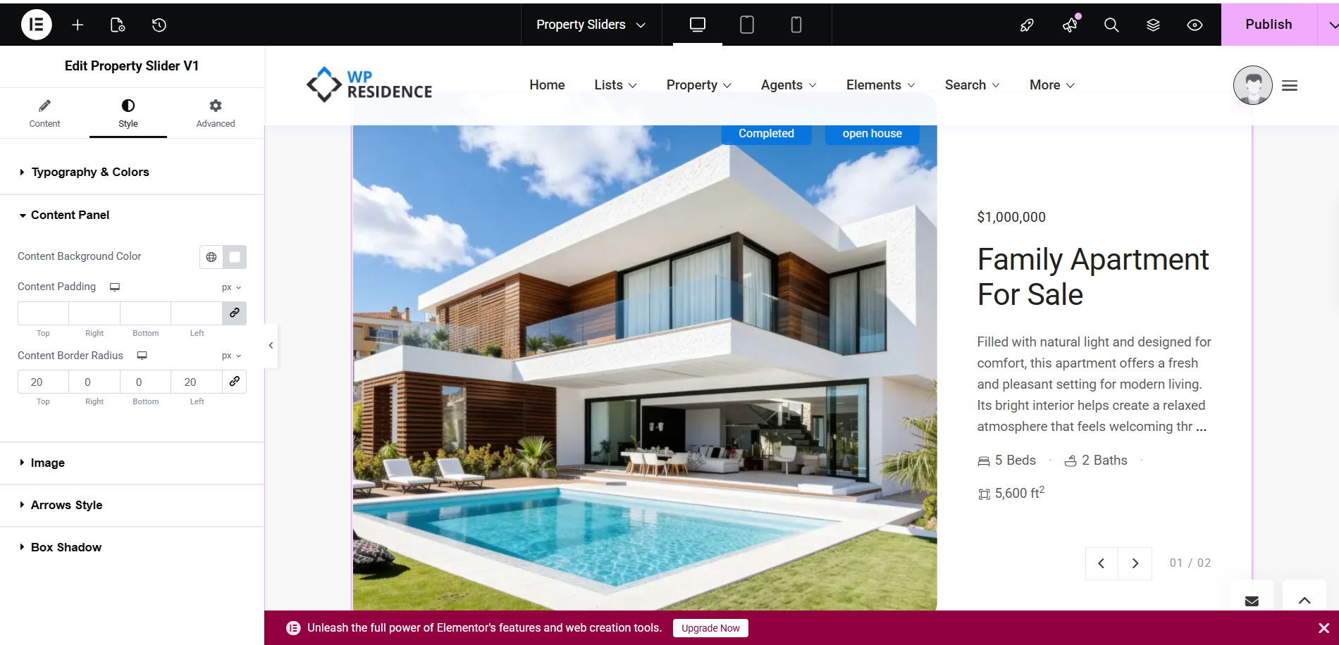
Style tab settings
In the Style tab, you can customize how the slider looks.
The available style sections shown in the screenshots include:
- Typography & Colors
- Content Panel
- Image
- Arrows Style
- Box Shadow
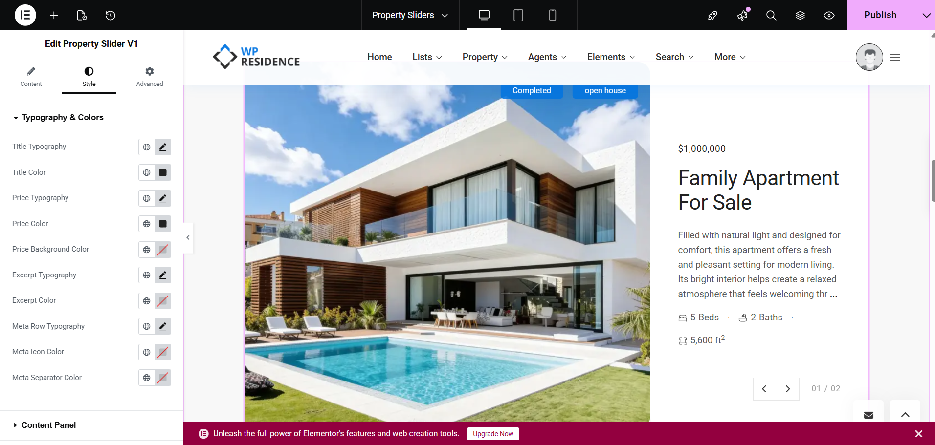
Typography & Colors
This section lets you style:
- Title Typography
- Title Color
- Price Typography
- Price Color
- Price Background Color
- Excerpt Typography
- Excerpt Color
- Meta Row Typography
- Meta Icon Color
- Meta Separator Color
These controls help you match the slider design to your site branding and typography.
Content Panel
This section controls the appearance of the content area.
Options shown in the screenshot include:
- Content Background Color
- Content Padding
- Content Border Radius
This is especially useful for the Editorial design, where the text area is displayed in a separate content panel.
Image
This section controls the image-related styling for the slider.
Arrows Style
Use this section to style the slider navigation arrows.
Box Shadow
Use this option if you want to add or adjust the shadow effect around the slider elements.
How the slider works
The widget displays the specific properties listed in the Items IDs field.
The final result depends on:
- the property IDs you enter
- the selected Design Type
- the selected Slider Orientation for Editorial layout
- the styling options set in the Style tab
If you want a modern and more premium featured layout, use Design Type 1 – Editorial.
If you want a more traditional and familiar layout, use Design Type 2 – Classic.