Property Slider V4 for Elementor
The Property Slider V4 widget lets you display a large featured property slider built with Elementor.
This widget is useful when you want to:
- highlight selected listings on the homepage
- show only featured properties
- build a visual hero section with property slides
- filter the listings shown in the slider by category, action, city, area, county/state, or status
The slider includes content settings, filter settings, and design controls in the Elementor editor.
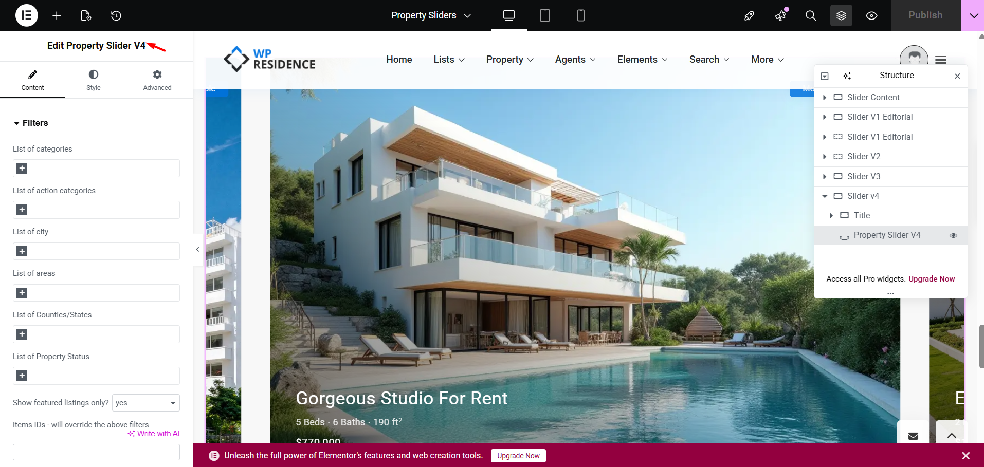
How to open and edit the slider with Elementor
To work with Property Slider V4, first edit the page with Elementor.
- Go to the page where you want to add the slider.
- Click Edit with Elementor.
- Search for the property slider widget in the Elementor panel.
- Add the widget to the page.
In the screenshot example, the widget title in Elementor is Edit Property Slider V4.
How to add the Property Slider V4 widget
After opening the page in Elementor:
- Add the Property Slider V4 widget to the page.
- Open the Content tab to define which listings should appear.
- Use the Style tab to control typography, colors, arrows, and other visual settings.
- Publish or update the page when finished.
Content tab settings
The widget content settings are split into 2 main areas:
- Filters
- Slider Settings
Filters section
The Filters section lets you control which properties are pulled into the slider.
Available filter fields include:
- List of categories
- List of action categories
- List of city
- List of areas
- List of Counties/States
- List of Property Status
You can use one or several of these filters depending on how specific you want the selection to be.
If you leave the filters broad, the widget can show more listings. If you use more filters together, the results become more specific.
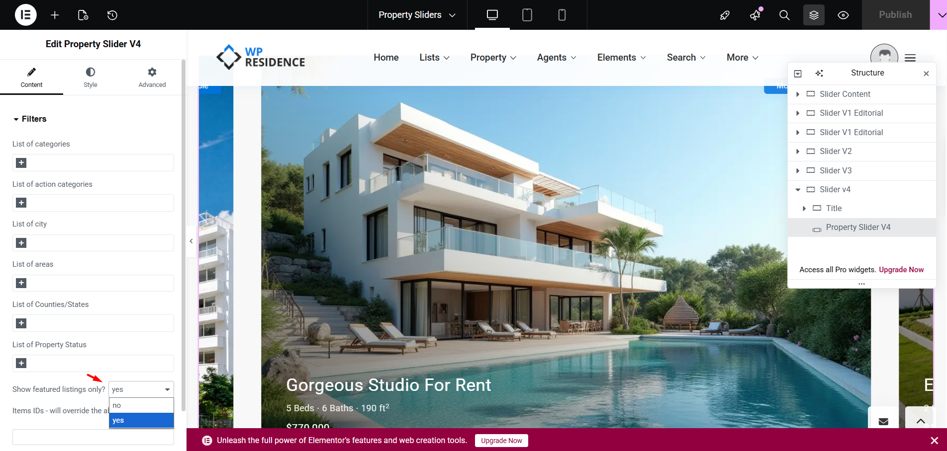
Show featured listings only?
This option lets you choose if the slider should display only properties marked as Featured.
- yes = only featured listings are shown
- no = the slider can show listings that match the other filters, even if they are not marked as featured
Items IDs – will override the above filters
This field lets you manually define which properties should appear in the slider by entering their property IDs.
If you use this field, it will override the other filters above.
This means the slider will display the exact properties you specify, instead of using category or location filters.
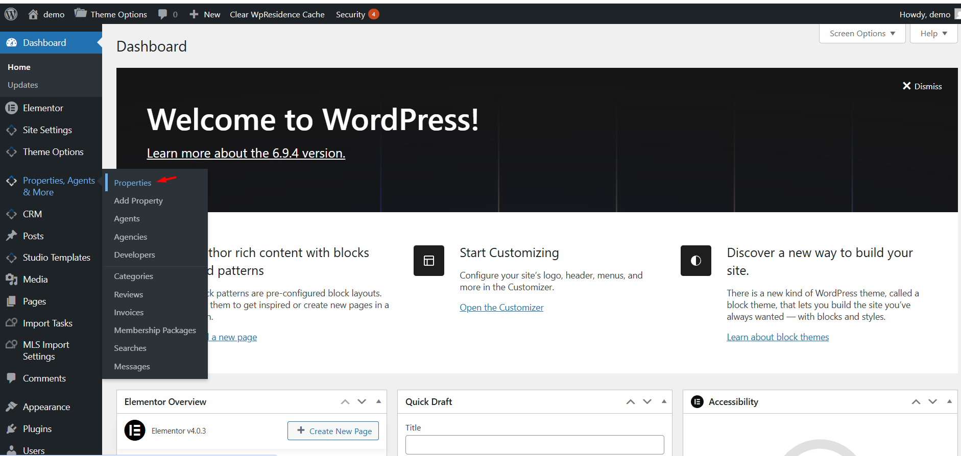
How to get the Property IDs correctly
If you want to use the Items IDs field, you need the correct numeric property IDs from the admin properties list.
- Go to Properties, Agents & More > Properties in wp-admin.
- Open the properties list.
- Look for the ID column on the right side of the list table.
- Copy the numeric ID of each property you want to include.
- Add those IDs in the Items IDs field in the slider widget.
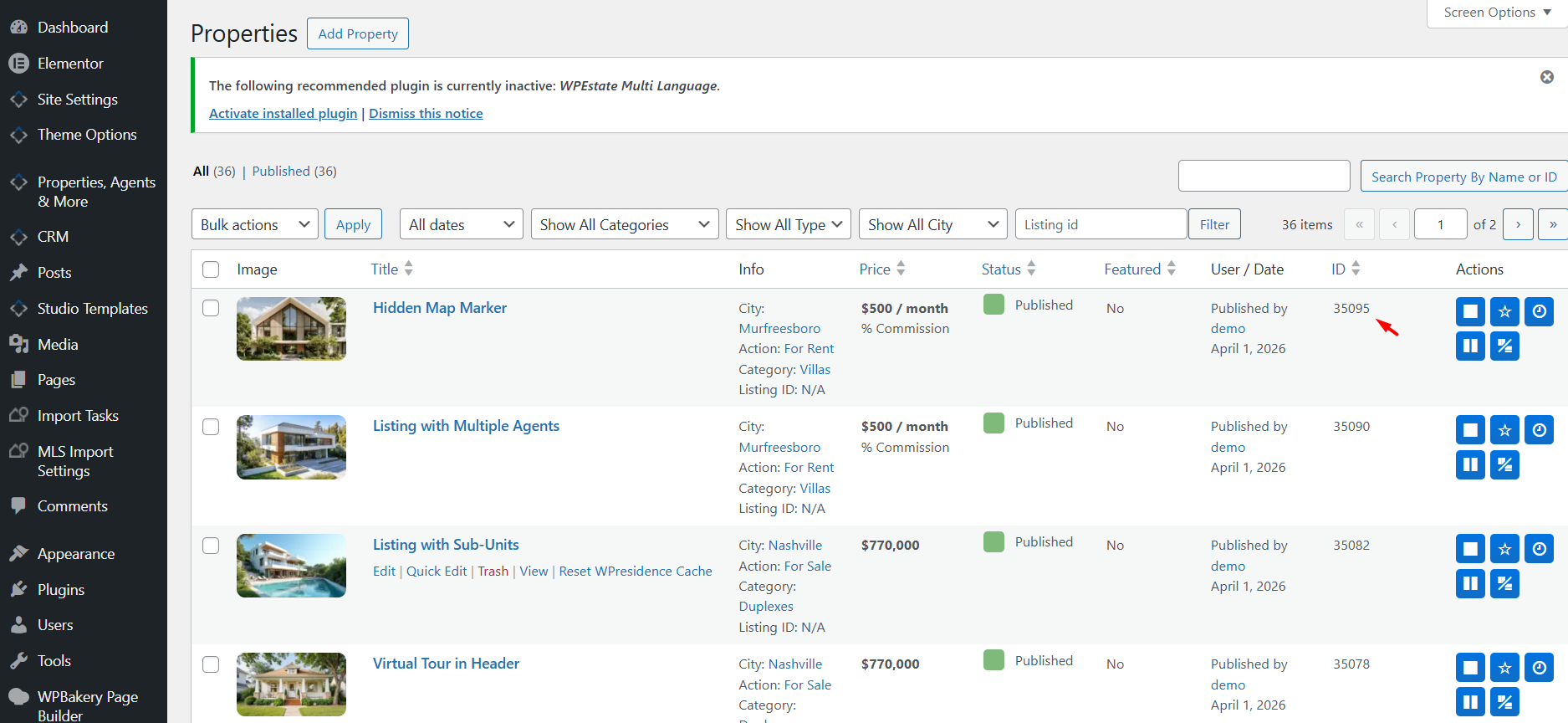
In the screenshot example, the highlighted property ID is 35095.
If you want to show multiple specific properties, add their IDs as a comma-separated list in the Items IDs field.
Example:
35095,35090,35082
Slider Settings section
The Slider Settings area controls how the slider is displayed.
Arrow Position
This option controls where the navigation arrows are shown.
Available options are:
- Above Slider
- Below Slider
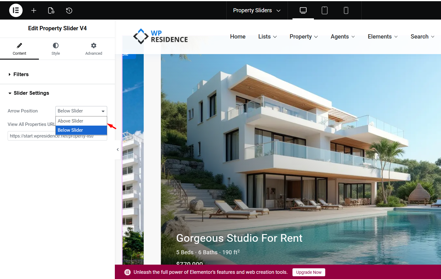
Choose the position that works best with your section layout and surrounding content.
View All Properties URL
This field lets you add a custom URL for the View All Properties button.
Use this when you want the button to send users to:
- a listings page
- a filtered search page
- a custom archive page
- any other page showing more properties
If you leave it empty, the button may not work as expected, depending on your design and setup.
Style tab settings
In the Style tab, you can customize how the slider looks.
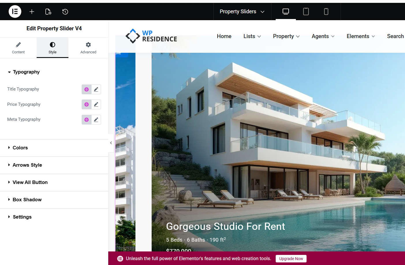
The available style sections shown in the screenshot are:
- Typography
- Colors
- Arrows Style
- View All Button
- Box Shadow
- Settings
Typography
You can customize the typography for:
- Title Typography
- Price Typography
- Meta Typography
This helps you adjust the text style to match your website design.
Colors
Use this section to control the colors used in the slider content and interface elements.
Arrows Style
Use this section to style the navigation arrows of the slider.
View All Button
This section controls the design of the button that links to the page you entered in View All Properties URL.
Box Shadow
Use this option if you want to add or adjust the shadow effect around the slider elements.
Settings
This section includes extra widget display settings depending on the design options available in your version.
How the slider works
The widget pulls property data from the listings that match your selected filters or from the property IDs entered manually.
The final result depends on:
- the filters you set in the widget
- whether Show featured listings only is enabled
- whether you use the Items IDs field
- the styling options set in the Style tab
If you want a curated slider with only a few selected properties, use the Items IDs field.
If you want the slider to update automatically based on listing terms, use the filter fields instead.