What these settings control
These options control the global design style for card units used across the website.
They can apply to:
- Property cards shown in property lists, taxonomy pages, search results, and shortcodes.
- Agent cards shown in agent lists and related agent sections.
- Blog cards shown in blog lists and archive pages.
Use these options when you want to adjust the general card design, such as spacing, background color, border size, and border color.
These settings control the global card unit design only. They do not control which fields, buttons, icons, or property details appear inside the property card.
Where to find the settings
Go to:
Theme Options > Property Card Design > Design Settings

What this section does not control
These settings do not manage the content structure of the property card.
For example, this section does not control:
- Which property details show inside the card.
- The order of the property card content.
- Which icons or labels appear on the card.
- The property card layout type.
- The buttons or actions displayed inside the card.
For more property card content and layout options, use:
Theme Options > Property Card Design
The Property Card Composer and the related Property Card Design settings allow more control over the content and structure of the property card.
Card internal padding
The internal padding controls the space between the card border and the card content.
You can set padding for each side of the card:
- Top padding
- Left padding
- Bottom padding
- Right padding
Add the value as a number, in pixels. For example, adding 10 will apply 10px padding.
Leave the fields blank if you do not want to apply custom padding.
Card background color
Use this option to set a custom background color for the cards.
Click Select Color and choose the color you want to use.
Card border size
This option controls the thickness of the border around the cards.
Add the value as a number, in pixels. For example, adding 1 will apply a 1px border.
Leave the field blank or use 0 if you do not want a visible border.
Card border color
This option controls the color of the card border.
Click Select Color and choose the border color you want to use.
If the border size is empty or set to 0, the border color may not be visible because there is no active border applied.
Property card example
Example settings:

Example applied to Property Unit Card v1:

More property card content and layout options can be managed from:
Theme Options > Property Card Design
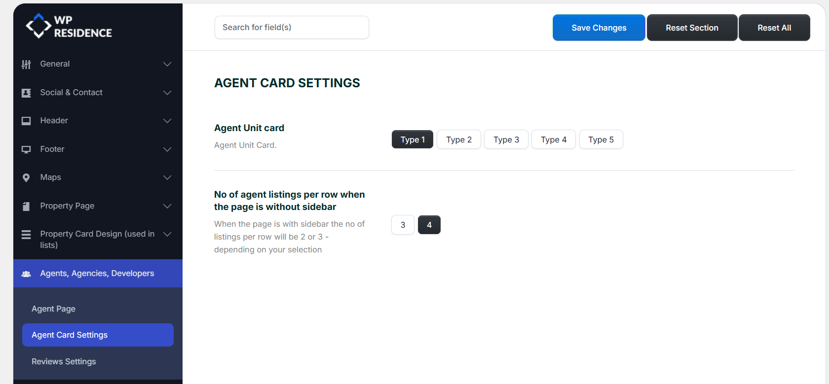
Agent card example
Example applied to Agent Card Unit Type 1:

These design controls can also apply to agent card types selected from:
Theme Options > Agents, Agencies, Developers > Agent Card Settings
Blog card example
Example applied to Blog Card Unit Type 2:

These design controls can also apply to blog card types selected from:
Theme Options > Blog > Blog Card Settings

If you change these settings and do not see the update immediately on the frontend, clear the theme cache and any cache plugin used on the site.