
The Call to Action widget allows you to create a visual section with an image, title, description, button, and optional ribbon.
Use this widget when you want to guide visitors toward an important action, such as viewing listings, contacting your agency, booking a consultation, or exploring a featured service.
How to add the Call to Action widget
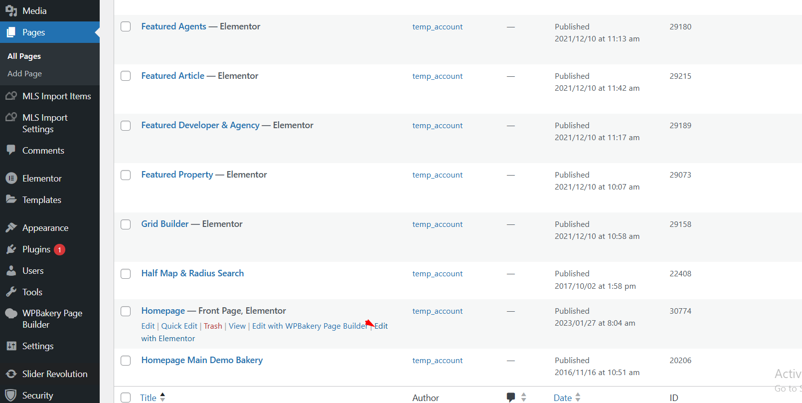
- Log in to your WordPress dashboard.
- Go to Pages and edit an existing page, or create a new page.
- Click Edit with Elementor.
- In the Elementor panel, search for WPResidence Call to Action.
- Drag and drop the widget into your page.
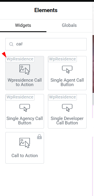
Image settings
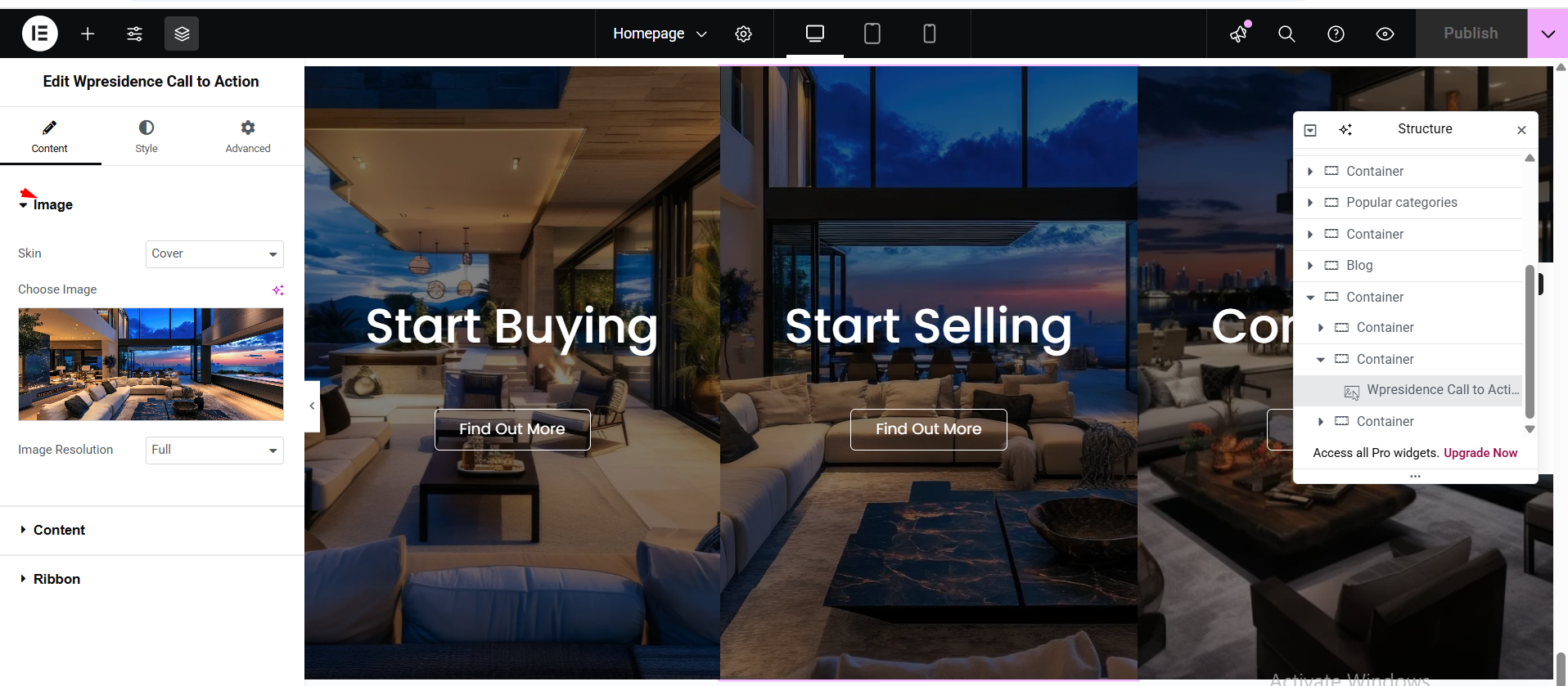
In the Image section, you can upload or select the image used in the Call to Action widget.
You can also manage image-related options, such as the image skin and image resolution, depending on the widget settings available in your version.
Content settings
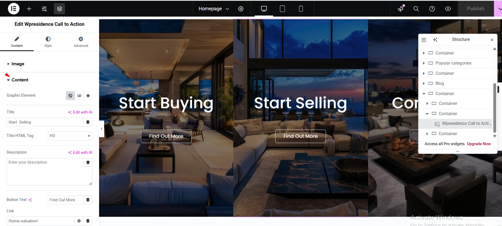
In the Content section, you can add the text shown in the widget.
You can edit:
- Title – add the main heading for the section.
- Description – add supporting text below the title.
Use a clear title and short description so visitors understand the action you want them to take.
Button settings
The Call to Action widget includes a button.
You can set:
- Button Text – for example, View Listings, Contact Us, Learn More, or Book a Tour.
- Button Link – the page or URL visitors will open when they click the button.
Ribbon settings
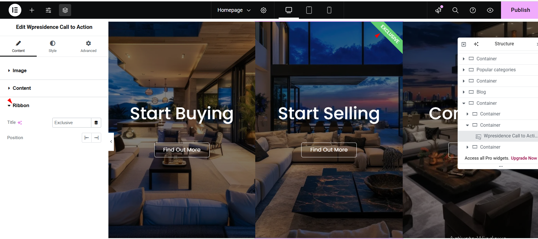
The Ribbon section allows you to add a small highlighted label to the Call to Action widget.
This can be useful for labels such as:
- Featured
- New
- Limited Offer
- Recommended
Style settings
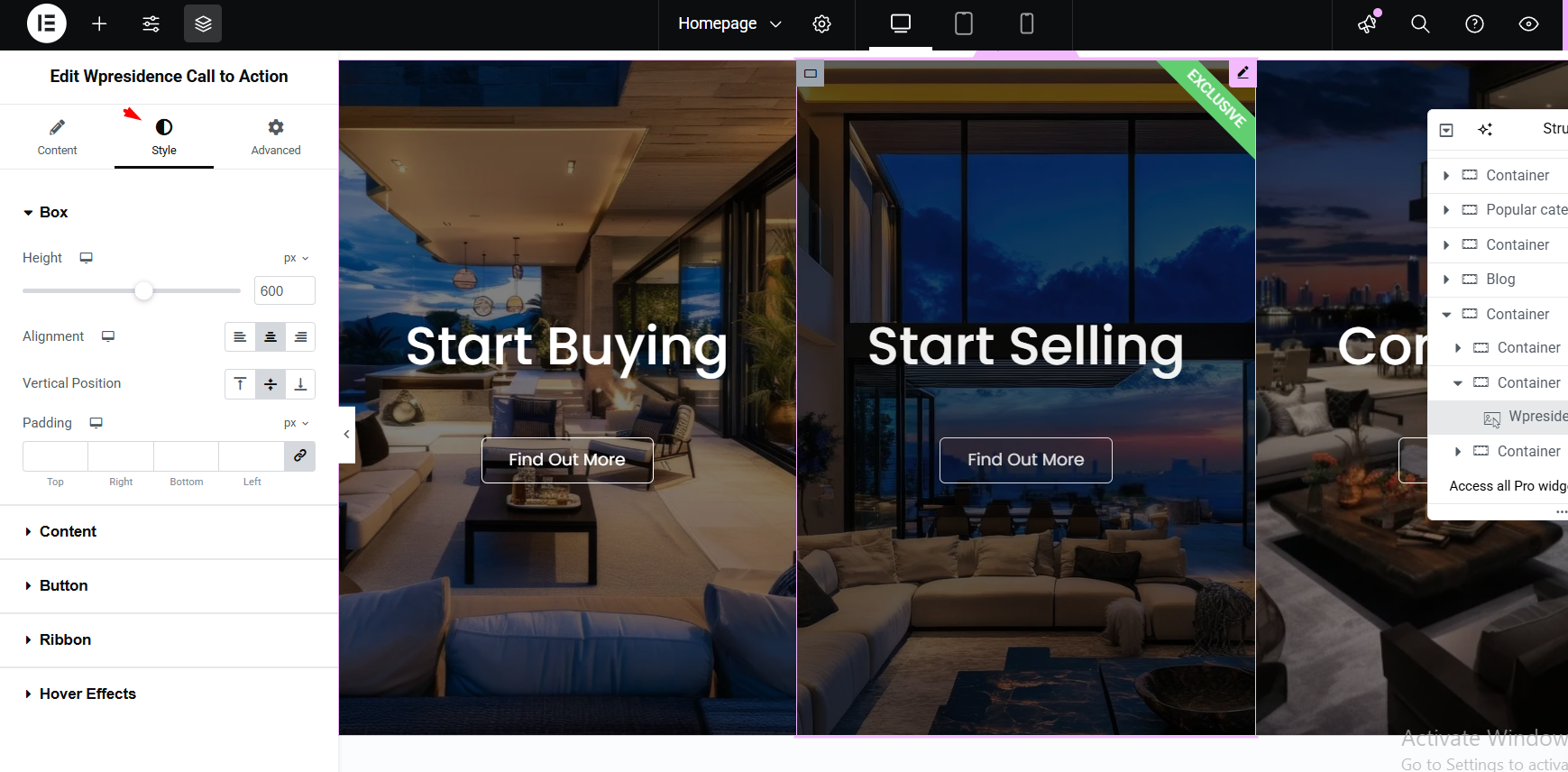
Use the Style tab in Elementor to adjust the design of the Call to Action widget.
You can manage options such as:
- Colors – change text, background, button, and ribbon colors.
- Typography – adjust font family, size, weight, and style.
- Spacing – control padding, margins, and layout spacing.
- Button design – style the button color, text, border, and hover effects.
Important notes
- The Call to Action widget is managed from Elementor.
- The widget can include an image, title, description, button, and ribbon.
- The button should link to the page where you want visitors to go next.
- Use the Style tab to control colors, typography, spacing, and button design.
- If design changes do not show immediately, update the page and clear cache if needed.