
Choose the Footer Type
In WPResidence, you can manage the footer in two different ways:
- Use the theme default footer and control its layout, colors, widgets, buttons, and copyright area from Theme Options > General > Footer.
- Create a fully custom footer with WPResidence Studio and Elementor Free.
How to manage header and footer with WPResidence Studio
Manage the Theme Default Footer
To manage the default footer, go to:
Theme Options > General > Footer
This section controls the default footer layout, footer widget columns, copyright area, footer buttons, footer colors, footer social icon colors, and footer background.
Footer Elements
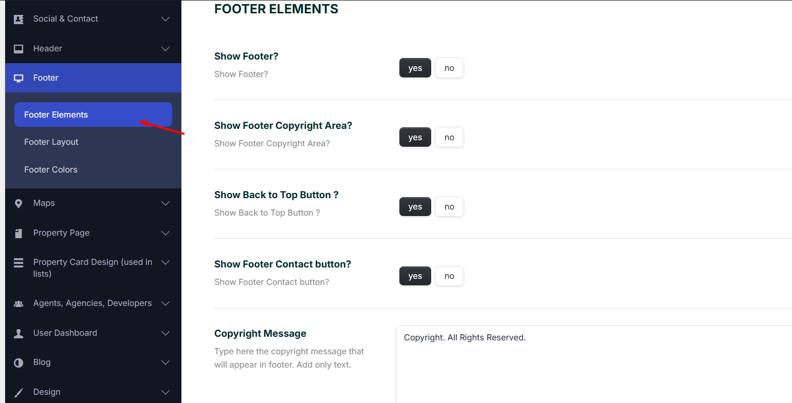
Show Footer
Set this option to Yes to display the default footer.
When this option is enabled, add the footer content from:
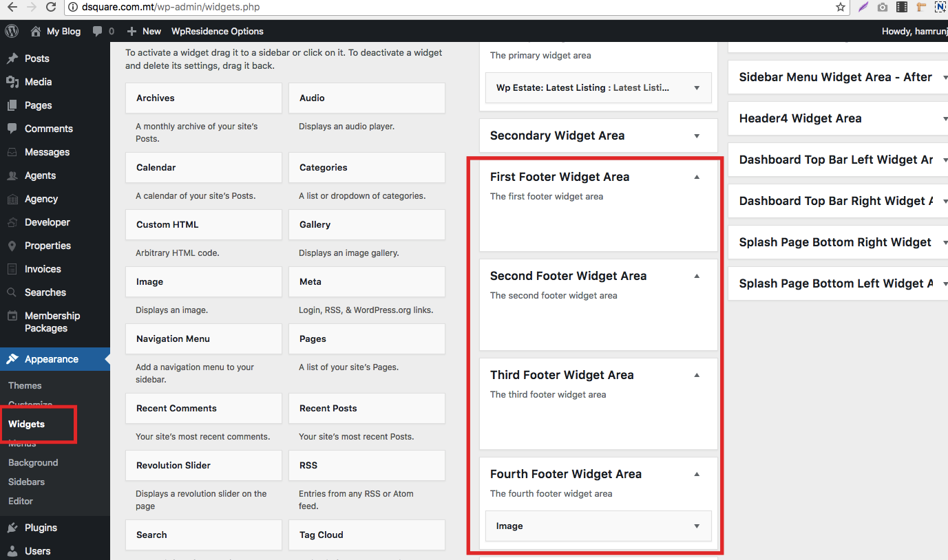
Appearance > Widgets
Use the footer widget areas to add text, menus, social icons, contact details, or other widgets.
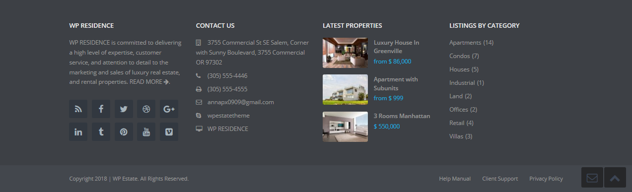
Footer Copyright Area
Show Footer Copyright Area
Set this option to Yes to display the copyright area under the footer widgets.
When this option is enabled, you can:
- Add the copyright text in the Copyright Message field.
- Assign a footer menu from Appearance > Menus.
How to add HTML links to the copyright message with a child theme
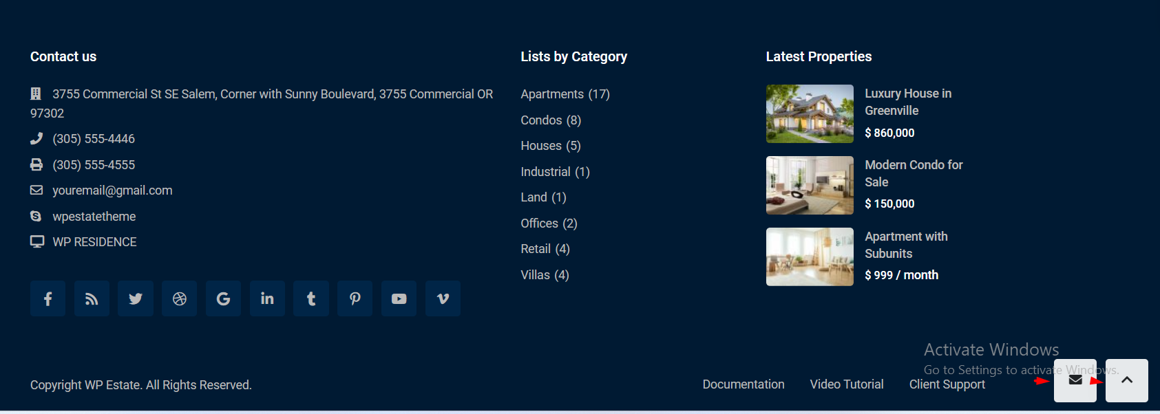
Show Back to Top Button and Footer Contact Button
These options control the footer floating buttons:
- Show Back to Top Button – shows or hides the button that scrolls the page back to the top.
- Show Footer Contact Button – shows or hides the contact button near the footer area.
Footer Layout
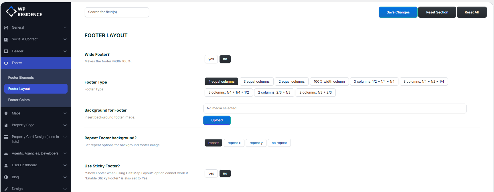
Wide Footer
This option controls the footer width.
- Yes – the footer stretches to the full screen width.
- No – the footer uses the default boxed container width.
Footer Type
Choose how many columns the footer should have and how the column widths should be arranged.
Available layouts include:
- 4 equal columns – four columns with equal width.
- 3 equal columns – three columns with equal width.
- 2 equal columns – two columns with equal width.
- 100% width column – one full-width column.
- 3 columns: 1/2 + 1/4 + 1/4 – wide left column and two smaller right columns.
- 3 columns: 1/4 + 1/2 + 1/4 – wide middle column and two smaller side columns.
- 3 columns: 1/4 + 1/4 + 1/2 – wide right column.
- 2 columns: 2/3 + 1/3 – wider left column.
- 2 columns: 1/3 + 2/3 – wider right column.
Background for Footer
This option allows you to upload a custom background image for the footer area.
Click Upload to select an image from the Media Library or upload a new image.
Repeat Footer Background
This option controls how the footer background image repeats.
- repeat – repeats the image both horizontally and vertically.
- repeat x – repeats the image only horizontally.
- repeat y – repeats the image only vertically.
- no repeat – displays the image once without repeating.
Use Sticky Footer
This option controls whether the footer stays fixed at the bottom of the browser window.
- Yes – the footer sticks to the bottom of the browser window.
- No – the footer displays normally after the page content.
Footer Colors
The footer color options control the main colors used in the default footer.
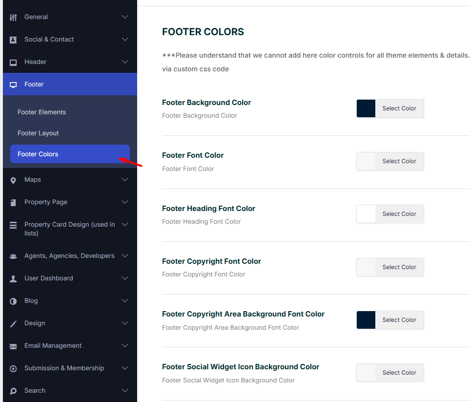
Footer Background Color
This option sets the background color of the footer area.
Footer Font Color
This option sets the default text color used in the footer content, including paragraphs and links.
Footer Heading Font Color
This option controls the color of footer headings, such as widget titles.
Footer Copyright Font Color
This option controls the text color in the copyright area.
Footer Copyright Area Background Color
This option controls the background color of the copyright area, which is the bar below the main footer.
Footer Social Icons Colors
The social icon color options from the Footer section apply to the social icons displayed in the default footer social widget.
Footer Social Widget Icon Background Color
This option controls the background color behind the social icons displayed in the footer social widget.
Footer Social Widget Icon Color
This option controls the color of the social icons displayed in the footer social widget.
Manage Footer Widgets
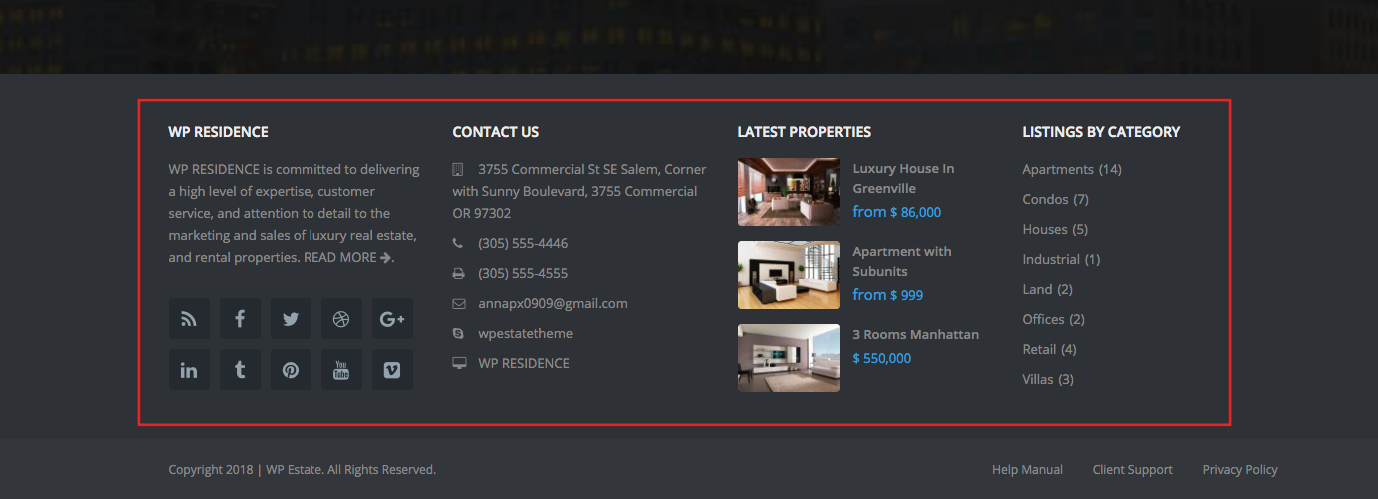
The default footer supports up to four widget columns, depending on the selected Footer Type.
To add content to the footer columns, go to:
Appearance > Widgets
Then locate the footer widget areas, such as:
- Footer Column 1
- Footer Column 2
- Footer Column 3
- Footer Column 4
Add widgets such as text, menus, social icons, contact details, or other available widgets to each footer column.
The widgets will show in the footer area above the copyright section.
Footer With WPResidence Studio
WPResidence Studio lets you build a custom footer with Elementor Free and assign it only where you want it to appear.
How to manage header and footer with WPResidence Studio
Use WPResidence Studio footer templates when you need:
- A custom footer layout built with Elementor.
- Different footers for different parts of the website.
- A footer assigned only to selected pages, post types, taxonomies, or archive pages.
- More control over spacing, columns, images, buttons, forms, and custom content.
WPResidence Studio supports footer-related template types:
- Footer – replaces the default footer in the assigned display locations.
- Before Footer – adds a custom section before the footer.
- After Footer – adds a custom section after the footer.
Footer Changes Do Not Show on the Front End
If you change the copyright year, footer colors, or footer social icon colors, but the front end still shows the old values, check the steps below.
Step 1: Save and Reload Theme Options
- Go to Theme Options > General > Footer.
- Make the change, for example change the copyright year from 2025 to 2026.
- Click Save Changes.
- Reload the Theme Options page.
- Check if the new value is still saved.
Step 2: If the Value Is Saved in Theme Options
If the value remains saved in Theme Options, but the front end still shows the old year or old color, this is usually cache.
Clear all cache:
- Theme cache, if used.
- Cache plugin cache.
- Server cache.
- CDN cache.
- Browser cache.
Then test the page again in a private/incognito browser window.
Step 3: If the Value Goes Back After Reload
If you save the value, reload Theme Options, and the setting goes back to the old value, WordPress is not saving the option correctly.
In this case, the issue must be checked on the site/server side. Possible causes can include a database save issue, security restriction, server rule, plugin conflict, or another process overriding the saved option.
Footer Settings Are Not Saved in Theme Options
If footer settings do not remain saved in Theme Options after reloading the admin page, check the following:
- Temporarily disable cache and optimization plugins and test again.
- Check if a security plugin or firewall is blocking Theme Options saving.
- Check if the server blocks large option saves or admin requests.
- Check if there are JavaScript errors in the browser console when saving Theme Options.
- Check with the hosting provider if the database can save WordPress options correctly.
- Test again with only the required theme plugins enabled.