This article will guide you through managing property card settings in your theme. The Property Card is a key component for displaying property details effectively. This article breaks down the process into several main areas:
Property Card General Settings
These settings control the appearance and behavior of property cards on your site. Changes here affect all property lists globally unless overridden elsewhere.
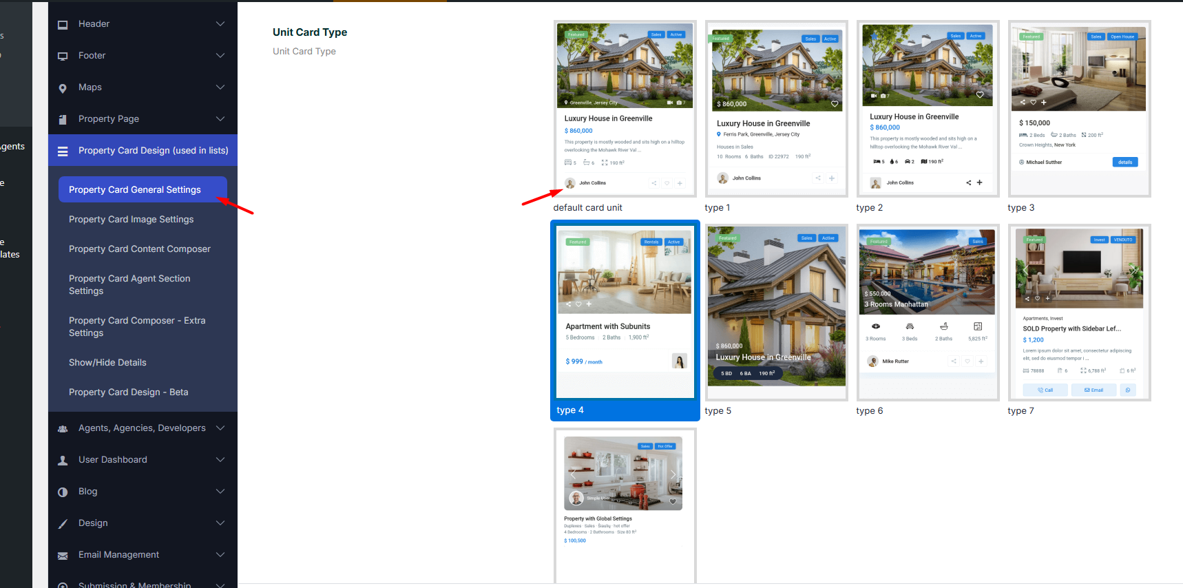
- Card Type Selection: Choose from various card types based on how you want your properties displayed
Other options available:
Property List Display (Global Option) – Choose how properties are displayed on list pages. Options: Grid | List
- Example: Selecting “Grid” will display properties in a grid layout; selecting “List” will display properties stacked vertically.
Number of Characters to Show in Property Title – Limit the number of characters displayed from the property title. Leave blank to show the full title.
- Default: 44
- Example: “Luxury Ocean View Apartment” → “Luxury Ocean View Ap…” (if set to 20)
Number of Characters to Show in Property Card Excerpt – Grid Style – Limit the excerpt length shown on property cards in grid style.
- Default: 90
Number of Characters to Show in Property Card Excerpt – List Style – Limit the excerpt length shown on property cards in list style.
- Default: 160
Click and Open Property Modal Window – Zillow Style – Enable this option to open a property in a modal popup instead of navigating to the property page.
- Options: Yes | No
Open Title Link to Property Page in New Window – Clicking the property title will open the property page in a new browser tab/window if enabled.
- Options: Yes | No
Number of Property Listings per Row (Without Sidebar) – Choose how many property cards appear per row on pages without a sidebar.
- Note: When a sidebar is active, the system will display 2 or 3 listings per row depending on your selection.
Property Unit/Card Minimum Height – Set a minimum height for property cards to maintain a uniform layout.
Show Modal for the “Call” Action in Card Type 7 – Enable a modal popup for the “Call” button in card type 7.
- Options: Yes | No
Text for the “Call” Modal in Card Type 7 – Customize the content displayed in the “Call” modal.
Placeholders:
- %property_id → Property ID
- %title → Property Title
- %realtor_name → Realtor Name
- %realtor_phone → Realtor Phone
- %realtor_mobile → Realtor Mobile
HTML Allowed:
- <br class=””> → New line
- <p class=””> → New paragraph
- <span class=””> → Custom styling
Example:
<p class="modal-title">%title</p>
<p>Contact: %realtor_name</p>
<p>Phone: %realtor_phone<br>Mobile: %realtor_mobile</p>
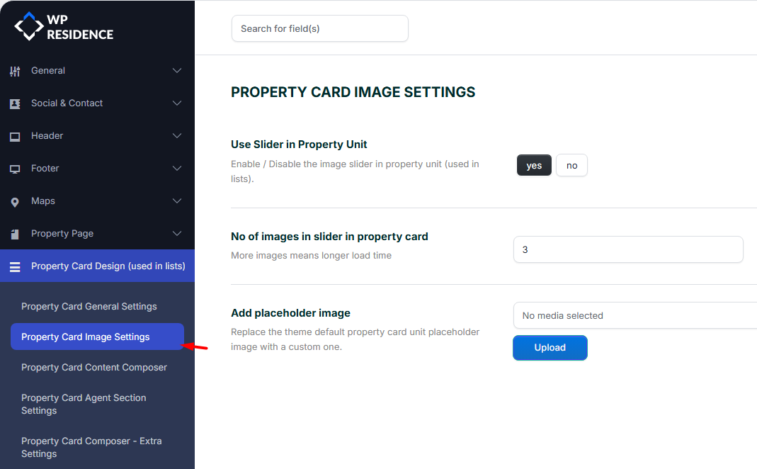
Property Card Image Settings
Here, you’ll manage the image settings for your property cards. Learn how to enable the image slider and customize the placeholder images that will appear if no property images are uploaded.
- Enable Image Slider: Display property images in a slider format.
- Set Placeholder Images: Assign placeholder images to properties without photos.
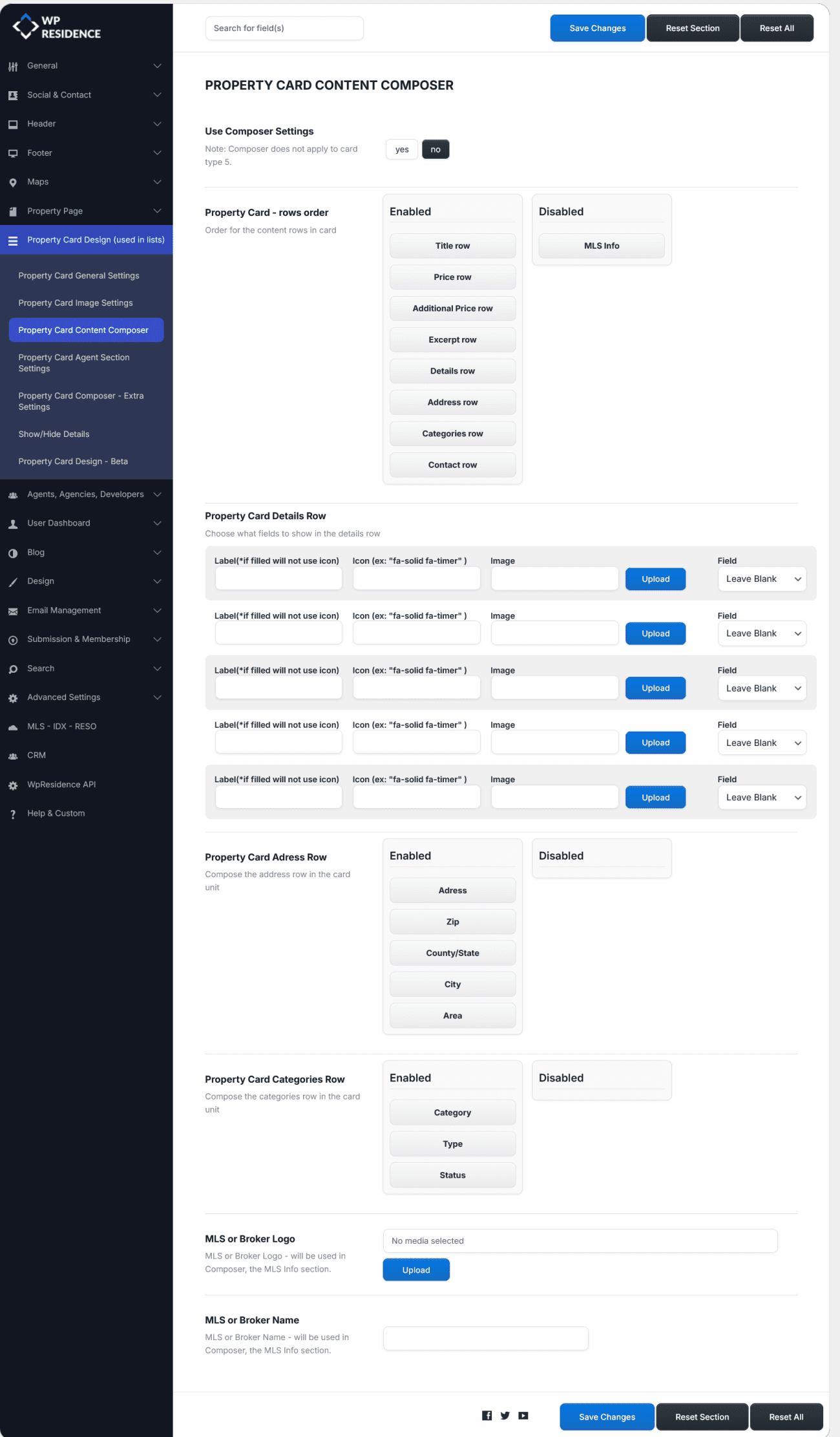
Property Card Content Composer
This section focuses on the content displayed within your property cards. You can manage which details are shown, such as property features, price, location, and any custom fields you’ve added. The content composer allows for flexibility in presenting this data.
- Control Content Visibility: Choose which property details are visible.
- Custom Field Integration: Add custom fields to display specific property information.
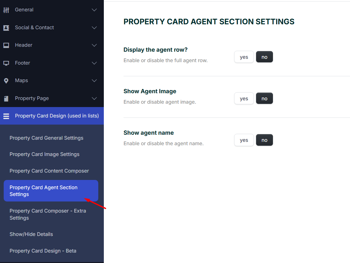
Property Card Agent Section Settings
These options allow you to control the visibility of the agent information row displayed on each property card (used in lists like search results, taxonomy pages.
Display the agent row?
Enable or disable the entire agent info row on the property card.
-
Yes – shows agent details (name, image, etc.) under the property card.
-
No – hides the entire agent row from the property card.
Show Agent Image
Toggle the visibility of the agent’s profile photo in the card.
-
Yes – displays the agent image.
-
No – hides the agent image (name may still show if enabled).
Show Agent Name
Enable or disable the display of the agent’s name below the property card.
-
Yes – shows the agent name.
-
No – hides the agent name (image may still show if enabled).
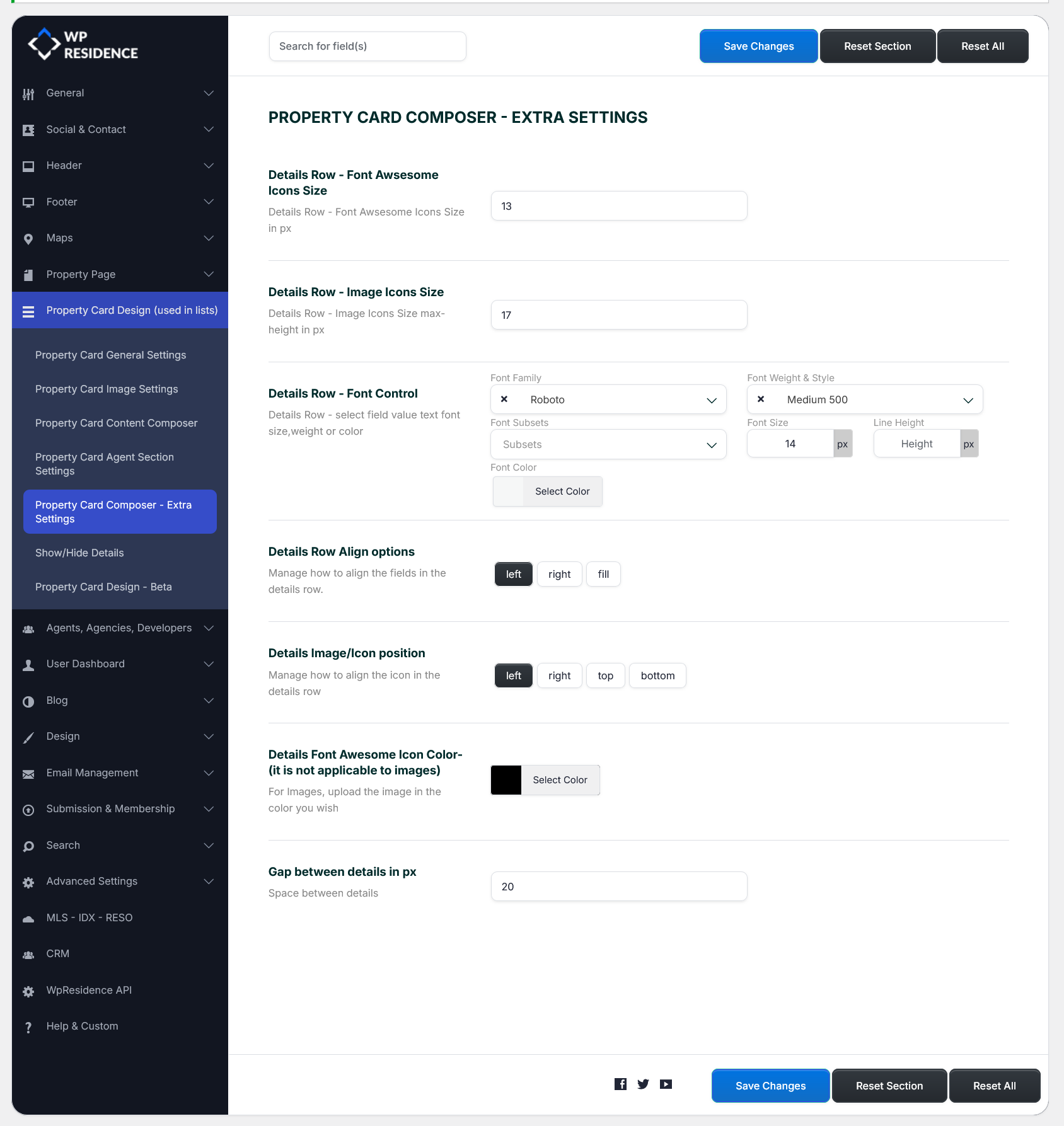
Property Card Composer – Extra Settings
This part focuses on advanced settings that help refine your property cards’ appearance. You can adjust font sizes, icon sizes, image dimensions, and even card layout spacing.
- Font and Icon Customization: Customize font sizes and icon sizes for better visual appeal.
- Card Layout Control: Modify the spacing and alignment of elements within the card.
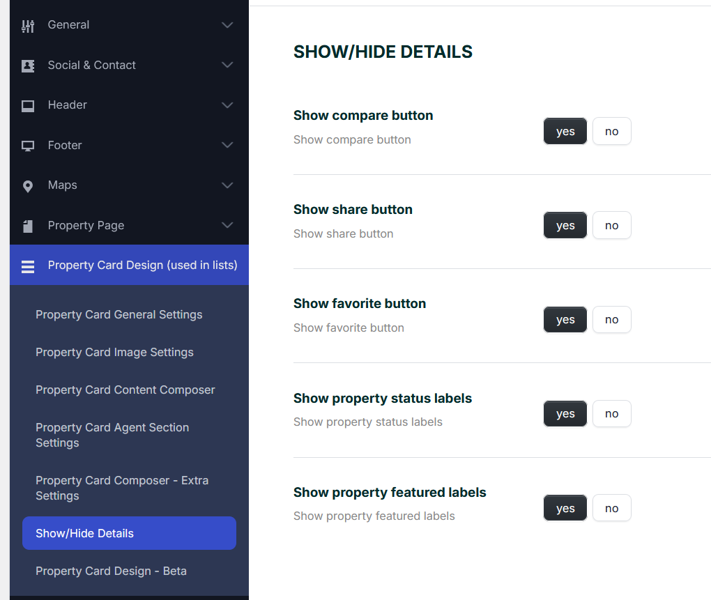
Show/Hide Details
Learn how to show or hide specific details on the property card, such as the compare, share, or favorite buttons. This section allows you to toggle the visibility of certain elements based on your needs.
- Disable Buttons: Disable the compare, share, and favorite buttons.
- Hide Property Status Labels: Hide labels such as “New,” “For Rent,” or “Sold.”